
You need to rethink your PowerPoint presentations.
We’ve all had the experience of being lured into a drowsy stupor by a lackluster presentation, but it doesn’t have to be that way. A great PowerPoint can harness the power of visual aids, becoming a phenomenal recall aid to expand the impact of your presentation.
Ready to be rid of boring PowerPoints? Use these five principles to bring your presentations to life.
1. Don’t recreate your notes
When your PowerPoint presentation is simply a colorful recap of your speech notes, you can expect your audience to start nodding off. Don’t think of your PowerPoint as a script – rather, it should provide a visual illustration of your point. Something for your audience to hang their hats on.
Instead of using the slides to double down on the content of your presentation, use them to illustrate your presentation.
Take a look at how this presentation uses screenshots, charts and photos to make a point: Twiplomacy: How Government Leaders Connect on Twitter. Almost none of the slides are speech notes.

2. Cut down on text
Hopefully you’re now scrapping your plan to turn your presentation into a teleprompter – so let’s take that one step farther and take out those giant paragraphs of text and bullet points. Text-packed slides do you the disservice of dividing your audience’s attention. Since they can’t listen to you and read paragraphs of text at the same time, they’ll end up tuning out one or the other.
Rather, call out important points and facts, and try to use as few words as possible.
Try this technique with bullet points, too, using an individual slide to make each point a punchy visual instead than trying to cram it all onto one page.
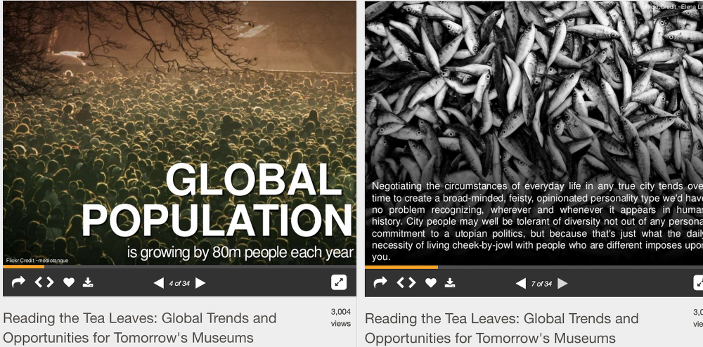
Check out this presentation: Reading The Tea Leaves. On the one hand it does a fantastic job of using big, bold images to highlight snippets of text, but on the other hand some slides are extremely text heavy. Put yourself in the shoes of the audience. Can you see how distracting those text-heavy slides are?
3. Be eye-catching, but legible
When going through the “Reading the Tea Leaves” presentation above. I had to lean into my computer to read the text in the text-heavy slides. You don’t want your audience to strain to get your point.
To avoid this problem, use the right size of font, and make sure there’s enough contrast that it can easily be seen. Use contrasting colors to highlight certain words or phrases – people like to skim, and even if you only have a sentence on each slide, highlighting will make it as easy as possible to get your point.
Try reading your slides from across the room on your computer screen to get a good idea of how legible they’ll be when presented.
Inside the Homeless World Cup is a great example of using contrasting text and images – the use of photos and fonts make it visually interesting, but it still is easy to read.

4. Use visuals to tell stories
Telling stories to illustrate your point is standard advice to speakers – audiences will more easily remember your points if they have a story to go with them. The beauty of a PowerPoint presentation is that it lets you use the visual progression of slides to further cement your stories into people’s minds.
When choosing images, think of each slide as a billboard. If you only could pick one image to illustrate your point, what will be the most powerful, eye-catching, and evocative?
Every idea in this Stories to Watch 2015 presentation is illustrated with a very powerful image.

5. Use transitions…
…but not transition effects. Forget the bouncing text, wipes, and fades. They may look fun, but they’ll only distract from the message of your presentation.
You should still give your audience a visual cue when you’re changing topics, or moving from one point to the next. Do this with a transition slide that states your next topic, and stands out from the format of the slides around it.
Impact Sourcing: Connecting the World’s Poor to Economic Opportunity is a great example of using transition slides. Note that it goes a step further, by marking every slide in the following topic with a different color so the audience knows they’re part of the same conversation

Go deeper
Want to learn more?
- This post on the TED blog has a fantastic roundup of tips and tricks from Aaron Weyenberg, TED’s UX Lead.
- Learn about the best PowerPoint alternatives from this LifeHack post.
- Need some examples? Check out this post from HubSpot for 25 inspiring PowerPoint examples.
- Learn how to present information that inspires your audience with Resonate, by Nancy Duarte – a book that is, of course, as beautifully-designed as it is informative.


Leave a Reply
You must be logged in to post a comment.