
If you’re like most people, you hate going to a meeting where the presenter reads verbatim from a bland PowerPoint presentation. So, how can you avoid common pitfalls and create a great presentation for your next meeting?
If your agency requires you to use a specific template, you’re obviously a bit stuck with how creative you can be. However, there are still a number of ways to avoid giving a boring presentation. For example:
- Use less text: When you put too much text on each slide, it becomes hard to read. And, your audience starts reading your slide rather than listening to what you have to say. So keep your text to short notes that capitalize on your most important points; or, don’t use text at all if you can illustrate your point instead!
- Add images: This could be pictures, graphs, tables, callout boxes, pretty much anything you can think of. If you are adding a graph/chart/table, try to keep the data presented to a minimum so that your audience can easily interpret what you have displayed. Use photos or graphics with caution—if they aren’t in the public domain, or you don’t have permission to use them, you could be violating copyright. A couple of sites have great, free graphics: Government-specific graphics; Various graphics (hint: use the search function to find the type of media you are looking for).
- Choose a single, easy-to-read font: Make sure that your font size is appropriate so that your audience doesn’t have to squint, and stay away from silly fonts that can derail your message and be difficult to read. Try not to vary the font too much as this can become a distraction.
- Make your presentation interactive: This doesn’t necessarily mean using flying graphics or spinning words. Instead, leave natural breaks in the presentation where your audience can ask questions or you can solicit feedback.
As an example of how to make use of some of the above tips while working within a template, here are a few agencies with above average presentations:
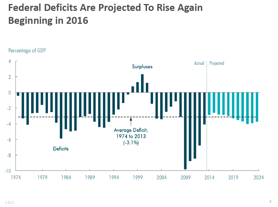
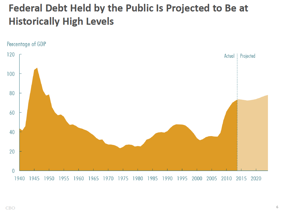
CBO: Here, the presenter makes excellent use of graphs and charts that are easy to read and understand
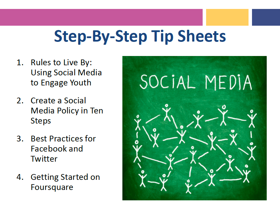
HHS OHA: This presentation utilizes graphics in a visually interesting way, and mainly uses bullets to highlight the most important points (although it does become a bit text-heavy in a few areas)
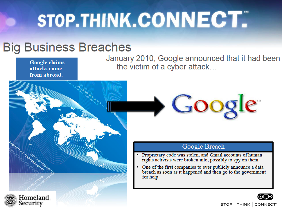
DHS: Although pretty text heavy, this presentation does a great job using charts, graphics, and callout boxes.
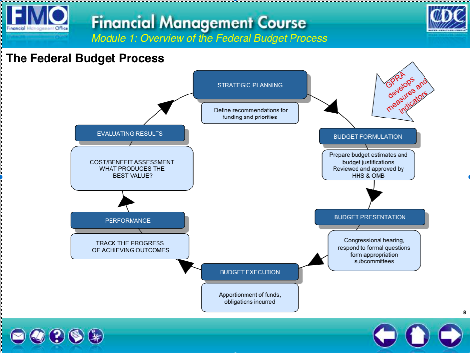
CDC: The federal budget process is such a complicated thing to explain, which is why I think the CDC does an excellent job breaking down all of the pertinent issues in a visually interesting way.
If you’re lucky enough to be able to choose your own format, you can create a truly awesome and engaging presentation, even if you aren’t a graphic designer. There are plenty of websites where you can pay to download a template, but I’ve chosen to highlight those that are free.
Prezi: While not really a template, Prezi is a far more customizable format for creating a presentation. You can sign up for a free basic account (upgrades require payment), and the site has a ton of free templates, or you can create your own. There is a lot of flexibility with graphics, charts and animation, and the layout is freeform rather than linear, like PowerPoint or Keynote.
emaze: This is a tool similar to Prezi in that you create your presentation online and then upload it to PowerPoint. It has a plethora of fantastic, free templates, all of which are highly customizable.
FPPT.com: This website has hundreds of free templates specifically for PowerPoint. Their best ones are animated, and provide a lot of flexibility for a great presentation. Here are a few of my favorites, that I think could make great government presentations:
- Idea clouds for a brainstorming presentation/session
- Clean, simple icons which can give some oomph to heavier presentation topics
- Instead of using cars/roads to present a roadmap, consider this game board template
- Heading for success? Check out this one.
- If you are trying to demonstrate the different moving pieces of your organization, consider a factory-based template.
- Timelines that focus either on where the company has been, where it is going, or how long an upcoming project might take can be displayed in a visually interesting way with these templates.
A couple of other useful tools:
- Creating flowcharts in PowerPoint can be challenging. FPPT.com has a number of visually interesting flowchart templates.
- Same goes for graphs. Check out great templates here.


Thank you for this valuable information. I teach PP in my agency. Each week i share a Monday Microsoft Tip. I plan to use some of what you have shared. Thanks.
Thank you so much for this valuable information. It will help me greatly in putting together some powerful power-point presentations and my new power-point presentations will engage the audience and keep them woke! I love this!
Awesome! Incredibly helpful. Thank you, Heather. Kudos.
Thank you for this!!! I am a trainer for my state organization and since we have no budget I receive no training on how to improve my presentations. The content I must teach is very specific but the WAY it is taught is where my flexibility lies. Having free examples of how to improve my product to make it more interesting is extremely helpful!!
Great links! Thanks for sharing.
Thank you for the helpful information. It will be very useful for future presentations.
One very valuable lesson I learned about creating a PP presentation was to never put more on a PP slide than what can be read if the slide were a billboard on the highway as you are driving by.
Jocelyn, that is a great lesson. I will pass that logic to my team. Thanks for sharing!
Ref: the “Burma Shave” signage where there were a series of red signs with white letters; i.e., http://www.fiftiesweb.com/burma1.htm. E.g.,
On curves ahead
Remember, sonny
That rabbit’s foot
Didn’t save
The bunny
Burma-Shave
😉
I am with Carol. We have no money for training and I am learning to create training videos and power points. These are great tips to help!! Thank you!
Presently, and although not required by my job I am working on some web site models that I purchased. These models are extraordinary in their content and “work-ability” for the novice. That being said, can’t the gov produce an archive of pre-designed power point presentations with “categories” and let us pick? What’s the problem? Why are thousands of dollars in wages paid to take classes/webinars not to mention the valuable time learning the intricacies of the power point design world when we have IT design staff that already produces fantastic government power point designs and presentations? My suggestion, create a library of “canned” power point categories and let the presenter pick, plug and paste their data, pics, etc. Power Point Presentation Library access , that’s the ticket!