At last night’s GovLoop Esri Meet Up: Maps Bring Your Story to Life, GIS lovers gathered to learn about and discuss one of Esri’s most successful applications- Story Maps! The event began with presentations from Esri workers, a real story map user at the National Oceanic and Atmospheric Administration (NOAA), and a story map expert at Blue Raster. After everyone was filled with best practices, attendees we able to network and participate in an interactive story map-making session with Esri employees.
How Story Map Templates Can Inform and Inspire
Jon Bowen, a Product Engineer in Esri’s R&D Center on the Story Maps team set the stage with addressing a simple, yet common question: What really is a story map?
Bowen says that every story has a geographical component, so Esri developed an application that allows any person to share their story through maps and figures in a visually appealing format. Story maps take what has traditionally been desktop oriented and made it more accessible online.
Raw analysis rarely makes a significant impact. However, bringing your boss an interactive, to-the-point map that displays key concepts will be sure to get their attention. Story maps have the ability to give the viewer want they want to see while stripping away any pesky, unnecessary details.
One of the most influential aspects of story maps are their ability to bridge the gap between stakeholders, government and the community while increasing public service. Esri has created templates that allow agencies to connect with their audience by simply plugging in data sets. The interactive features of story maps also allow viewers to steadily receive information and reach different levels of understanding.
An example is a story map that Esri made with the Wildlife Conservation Society that illustrates the rapid decline of African Elephants. Particularly devastating about the map is a case study that shows the correlation between elephants wander towards roads and being gunned down by poachers. The story map delivers real images and data that helped the society spark action among concerned citizens.
How NOAA Improved its Storytelling Techniques by Integrating Data and Imagery
Ken Buja, the senior GIS Developer for NOAA’s National Centers for Coastal Ocean Science (NCCOS) interestingly enough used a story map to aid his speech on story map utilization at his agency. NOAA’s first story map was developed in 2012 in conjunction with a 500-page report. The creators of the report wanted to compile all the information into a useful tool for the communities they were assisting to utilize. Buja coded his own story map to display all the critical information from the report that was shared throughout the community.
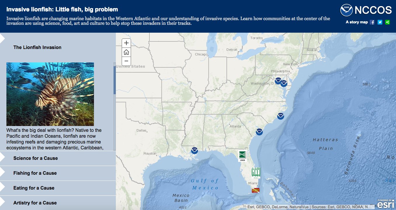
After the great success with the first story map, Buja decided to try another effective story map but this time used the countdown template. After noticing the influence Buja’s story maps had, other departments within NOAA reached out to collaborate. A memorable map displayed information on invasive lionfish, a species that are changing marine habitats in the western Atlantic. The map shows how communities at the center of the invasion are using science, food, art and culture to combat the invasion. The section: Eating for a Cause shows how coastal managers are using culinary to control lionfish populations. The Reef Environmental Education Foundation (REEF) even created the Lionfish Cookbook in an attempt to build awareness of the cause. Additionally, the story map allows viewers to browse restaurants along the entire coast that feature lionfish on the menu.
As NOAA began creating more and more story maps, they began to reduce text and increase imagery to more effectively get their point across to the audience. Through NOAA’s GeoPlatform, the public can search through story maps and filter the information that is most important to them. Once a task for web developers, NOAA’s scientists can now use the platform to use the simply technology to create their own maps. This allows the person that knows the data the best to tell the story, ultimately enhancing efficiency.
Buja continued to discuss case studies of how NOAA has used story map technology to extend their reach, both domestically and internationally. An example is a story map that gives information on where king tides are affecting coastal areas. A historical map shows the fluctuations in tornadoes, particularly one of the largest outbreaks that occurred in 2011. Most recently, a map including a radar video and images show heavy rainfall in California that led to severe mudflows.
NOAA has helped develop story maps from the very beginning. From Buja coding his own map to solely utilizing Esri’s already prepared templates, the story map application has allowed NOAA employees to display their data in the most effective way.
Top Ten Tips for Story Maps
Christina Phang of Blue Raster follows Buja with a comprehensive top ten list of best practices and tips while creating story maps:
- Curate your story: hone in on what you are actually trying to say. Think about how you want to engage people? You can utilize Blue Raster’s story map starter kit that highlights the beginning steps in creating an effective story map.
- Simplicity is key to getting the attention of your audience. There must be minimal interaction to “get to the point”. Really consider what is relevant and remove anything that is not.
- What makes sense for your audience? For example, policy makers like to see economic and social impacts. Also it is helpful to incorporate social media to show relevancy to the public.
- People expect things to be mobile friendly and responsive.
- Keep bran colors consistent. Blue Raster works with many agencies and organizations to create maps. By keeping the brand colors consistent throughout the map, the viewer has an easier time associating information.
- UI/UX: Attempt to get your point out in the shortest amount of time. Too many sections lose the viewer.
- Create compelling content: “We live in a 140 character world”. Creators should aim to keep descriptions and information one sentence long.
- Details matter: don’t forget popups!
- Don’t make your viewers think. Pictures add a human component and allow the viewer to resonate with the information.
- Call to action, what can readers do after? Your map should make the audience want to make a difference after viewing your information.
Onsite Activity and Networking
After the presentations, the attendees dispersed to discuss what they learned (and eat yummy food!). Attendees were also able to create their own story map with the help of Esri workers. There were six stations to spend one-on-one time with an expert that was able to answer all questions. For those who were unable to attend, here is a link to an interactive story map demo.
In the lobby, attendees dived into robust conversations with their fellow GIS lovers. This event is a part of GovLoop and Esri’s yearlong series of Meet Ups that each focus on separate GIS themes. Don’t miss out on the next opportunity to learn more about GIS and network with your peers. The next Meet Up will be on August 20th, and focused on communicating with maps. Keep an eye out for emails that will contain more information!


Leave a Reply
You must be logged in to post a comment.