
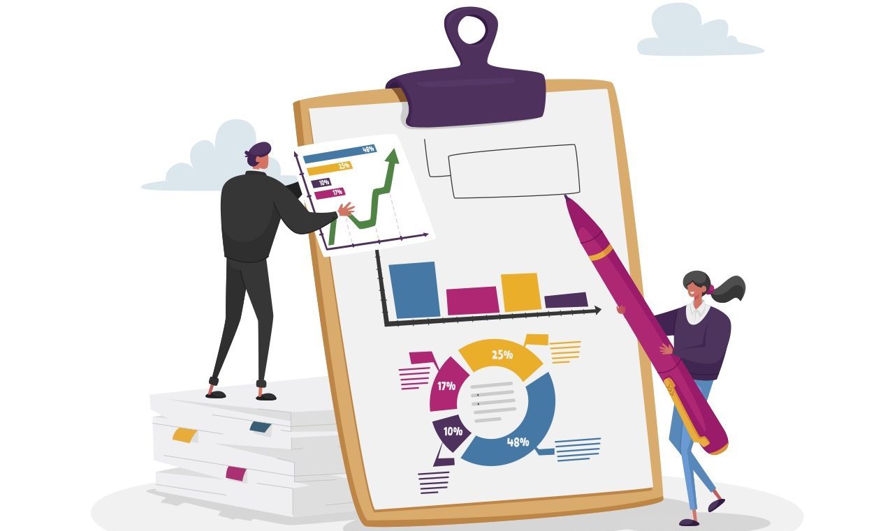
Agencies generate and analyze a lot of data these days. In terms of communicating, internally and externally, that can be both a blessing and a curse. We talked to three employees at the Cambridge, Massachusetts, Community Development Department (CDD) about how they use visualization to help data fulfill its purpose.
“There’s nothing more transparent than raw data. But that’s not accessible to people,” said Brianna Garcia, CDD’s Communications Manager.
That’s where data visualization comes in. Increasingly, users expect data to be something they can see, not just read.
Cliff Cook, Senior Planning Information Manager, who’s been at CDD for 26 years, said the change began about 10 years ago. “Before, you could give them a data table and they’d accept it. And at that point, they started saying, ‘No, we want to see the chart,’” Cook said.
Understand What Projects Benefit From Visualization
To choose what data to transform, consider which data will benefit.
“It’s usually a situation where you’ve got one of two things. [One is when] you’ve got a lot of data. The U.S. Bureau of Labor Statistics collects masses of data. It’s hard for the average person to make sense of them. But when you create visualizations, even if they’re fairly simple, you can start to see patterns, you can start to draw conclusions,” Cook said.
“Another is when it can drive different ways of interpreting the same data. It’s where data would benefit from curating,” he added.
Curating doesn’t mean misrepresenting, to be clear. Instead, Cook said it means choosing which aspects of the data are relevant to the discussion or decision to be made.
He cited the example of a data analysis that changed the interpretation of census data for Boston. “You want to use the data to help people understand what’s going on in your community. One of the important ways to curate the data is by visualizing it,” Cook said.
Ground Your Interpretation in Reality
“You have to anchor your interpretation in the world you see around you,” Cook said. “When I work with data, I’m always thinking about ‘ground-truthing’ it. If this doesn’t sound right, it probably isn’t. Start asking questions of people who have got some information on the ground.”
Don’t forget qualitative data, either.
“There tends to be an overreliance on quantitative data in the planning profession,” said Melissa Peters, CDD’s Director of Community Planning. “It’s really important to tell stories of the people who live here, and that too can be visualized in a compelling way.”
Include the Right People
There are now more people coming out of planning programs who are fluent in data visualization and can work with more sophisticated applications, though it can be slow going to get them into local organizations. But there’s software for staffers at varying levels, especially if you can invest in training.
“You can produce some really nice data visualizations with Excel,” Cook said. “There are more tools available that are more accessible to people who aren’t hardcore coders, but they still require training and expertise.”
Another essential skill set is graphic design. “We always try to consult with a graphic designer,” Cook said. “You can make or break a visualization with things like fonts and line weights and colors.”
Also include potential users who are unfamiliar with your data. “Even more important than the tools are the perspectives involved in creating the visualization,” Garcia added. “Having someone with close to no knowledge about the thing you’re communicating is invaluable.”
Keep in Mind Who — and What — You’re Working For
“The hope is that we conduct our public processes in a way that’s engaging, welcoming and inviting — and understandable — so that people can participate,” said Peters. “We work for the people of Cambridge, so we want them to be involved. If we can make something as complex as transportation engineering, road design or zoning simpler so that people can engage, that’s a win.
“At its essence, data visualization is a communication tool,” she said. “Our goal as a government entity is to be open and transparent in communicating information we collect, so that it’s objective and useful as a tool for community discussion and decision-making.”
This article is an excerpt from GovLoop’s guide “Your Data Literacy Guide to Everyday Collaboration.”


Leave a Reply
You must be logged in to post a comment.