
Geographic information system (GIS) is back – and we’re not just talking about maps this time. We’re talking about a tool that creates a new vision of health improvements – a data-driven way to visualize and understand the large volumes of data and the allocation of resources needed for healthy communities.
So yes, maybe we’re still talking about maps, but only because now more than ever it’s important to leverage the power of place.
In Thursday’s online training, “Building Healthy Communities,” experts shared best practices from health and human professionals who are utilizing GIS technology to bring their data to life, open up the process, and discover real insights into what’s going on in the geographies they serve.
Speakers included:
- Angelica Baltazar, Health and Human Service Industry Specialist, Esri
- Michelle Winz, District Epidemiologist, Portsmouth Health Department, Virginia
- Jared Shoultz, Health Technology Specialist, Esri
Here are the who, what, where, why and how, to help you learn how GIS can help your community determine priority target-intervention areas, and make where you work, live and play a healthier location:
Who: Health and human services professionals
Though health and human services are at the center of this movement, they can’t do this alone. “They need to collaborate with a variety of programs and departments in government and all of these supports can be connected via a location platform,” stated Baltazar prior to diving into the full advantages of GIS.
What: GIS
Baltazar describes GIS “like any other system you’re accustomed to, the only difference is the inclusion of geographic data.” Here are some benefits of GIS and how it matters to all organizations, including health and human services:
- Location-enabled: it gives you instant access to what’s going on in the geographic areas that are important to you. “Your organization has its own distinct territories and districts and if you’re mapping out data in the way that’s going to provide most information, you need to be able to map to your region – the ones that matter to you,” said Baltazar.
- Applied to government problems: results in time-savings, increased efficiency, communication and collaboration, and automates workflows.
- Not just for analysts: it’s for everyone in the organization – you have the ability to define the level of access and connect your programs and products seamlessly.
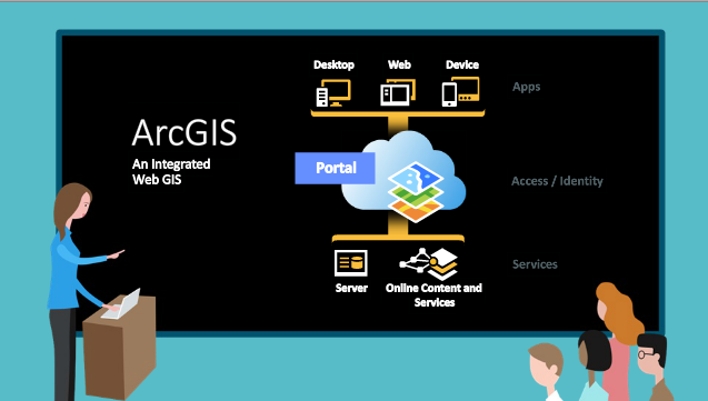
Where: The full suite of ArcGIS
Shoultz discussed how to enable the full suite of ArcGIS capabilities (pictured below). The three assets includes:
- Desktop, web and device: applications that are available on any device, anywhere, anytime
- Portal: for internal and external use to access and identify location, based on the information most important to them
- Server and online content and services: services for group organization and sharing of content that includes a single sign-on experience
Why & How: the different problems that ArcGIS platform solves, and the different ways to map your data
- Problem #1: limited resources available and no single organization that has all the expertise, data or resources needed to address underlying issues alone
- Problem #2: number of internal business units presents challenges related to coordination, data discovery, and data integration
- Problem #3: data presented in spreadsheets with different data models, formats and structures
Solution: Shoultz discusses the benefits of Esri Map for Office, which can map information directly out of excel, share it out, and overlay it to get a better idea of what patterns exist in data – tabular data transformed into spatial data.
- Problem #4: map measles, occurs when you can no longer get information out. “It’s impossible to see what’s going on other than there’s a lot of data,” said Baltazar on issues surrounding large volumes of data.
- Ways to map your data include:
- Clusters
- Plot data on map (beyond administrative areas)
- Heat maps (shows where concentrations of data are). Baltazar encouraged the audience to go beyond heat maps, which only show where the density of your data is highest or lowest, to hot spot mapping, to discover where concentrations of your data are based on the attributes of your data and what’s statistically significant in your data.
- Ways to map your data include:
As Baltazar put it, “Becoming a healthy community is all about leveraging technology, including GIS to its full advantage.” To learn more about the modern platform, and see a full demonstration, be sure to view the on-demand training here.
A second recap will feature the case studies from this online training – be sure to look for it on the trainings page next week.


Leave a Reply
You must be logged in to post a comment.