
All the software tricks in the world won’t make your presentations interesting and engaging. To accomplish that feat, you need to change how you deliver information, including what you put in your PowerPoint slide deck.
A fearless public speaker has confidence in themselves, in what they plan to say, and in the quality of their PowerPoint slides. To give better presentations, you can and should learn how to use PowerPoint more effectively.
If you want your slides to have more oomph and less ho-hum, here a three simple ways to create more fabulous PowerPoint presentations:
1. Ditch the bullet points
Heed this oft-repeated advice: To greatly improve your PowerPoint presentations, stop using bullet points. This advice bears repeating because:
- your boss is still using bullet points
- your coworkers are still using bullet points
- you’re still using bullet points
Bulleted lists are one of the most drab, ineffective ways to display information in PowerPoint. While lists can help organize information in a clear, logical way, a bulleted list style doesn’t enhance information with additional meaning. Bullets are also monotonous when they’re used in slide after slide after slide.
Bullets should be the exception, not the rule. But, if you’re avoiding bullet points in PowerPoint, what can you do instead?
Redesign your slide to offer the information in a different way. Create an eye-catching layout that incorporates the information. Put each bit of information into its own compartment. Add color, images, and other pieces of tasteful visual interest.
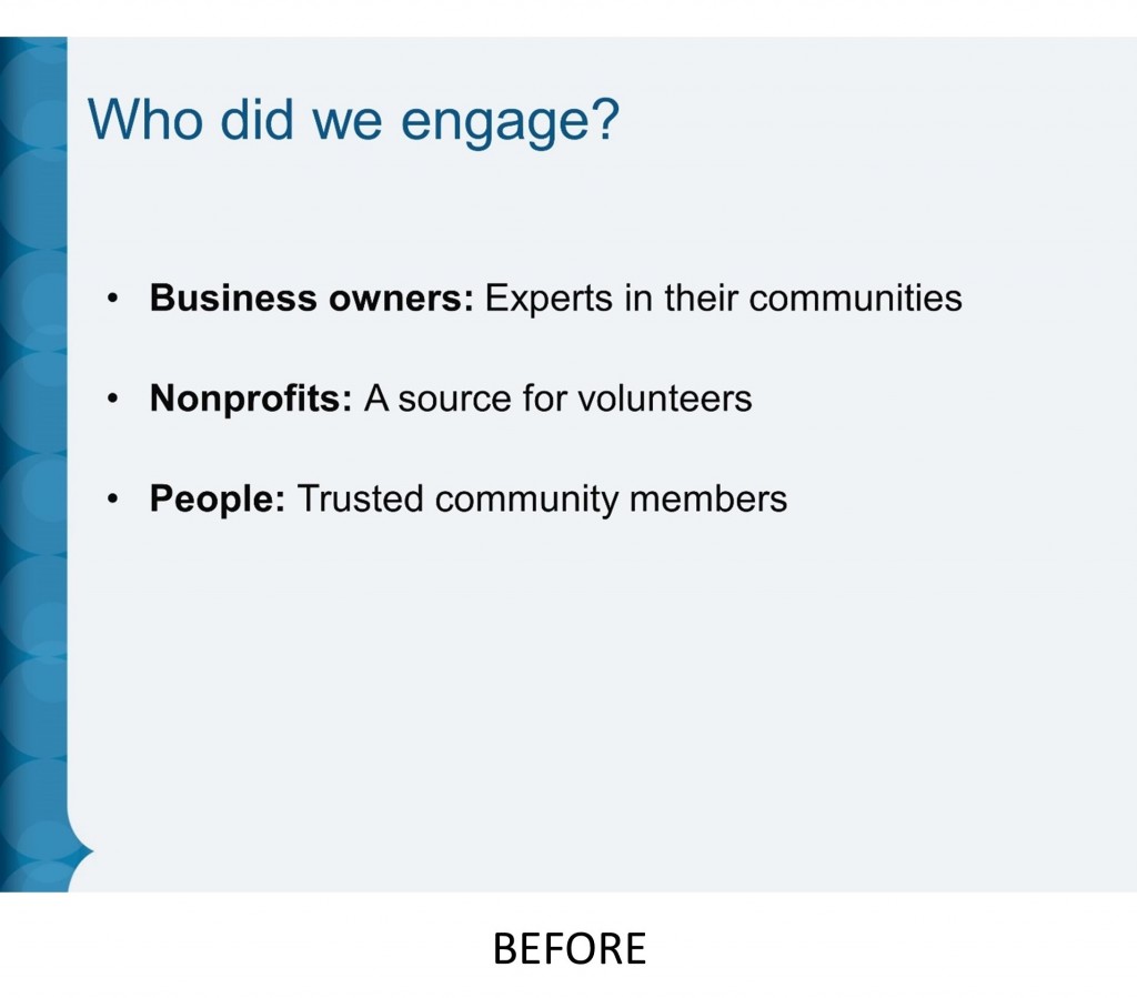
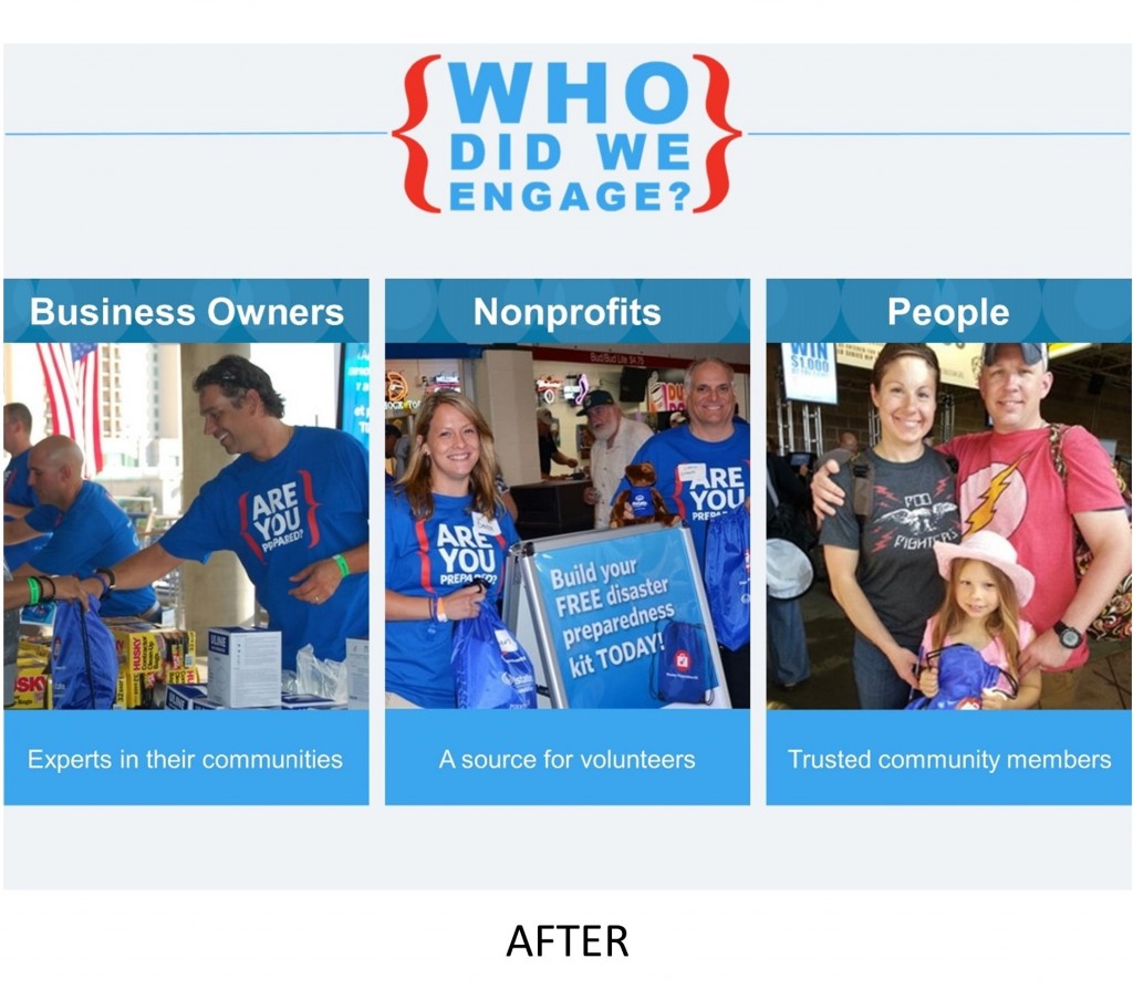
Here’s an example of how I transformed a bullet-burdened slide into something much more interesting for one of my clients:
For more stylish bullet point alternatives, dive into these ideas by Scott Schwertly, Slideteam, and Podium Wisdom.
2. Bump up the font size
As a PowerPoint user, you’re at a disadvantage. You have to design your PowerPoint presentation on a computer screen perched only a few feet from your face. Yet your audience will experience your slides very differently.
Some people in your audience will sit close to the screen, others way in the back. Your audience might see your slides beamed to a new, bright high-definition monitor with overhead lights dimmed down to the perfect level. Or, they might see slides that are distorted, dim, and out of focus because the ancient projector has to be propped up on an old phone book.
Before you create your PowerPoint presentation, imagine yourself in your audience and design for their experience. Be sure to learn more about where you’ll give your presentation, including the room size and layout, and the screen size and type. Choose a large enough font size so people in the last row of seats will be able to read your words.
If you can’t test your slides in the actual room where you’ll give your presentation, do your best to mimic what your audience will see. Put distance between yourself and your computer screen, and change your screen brightness and contrast.
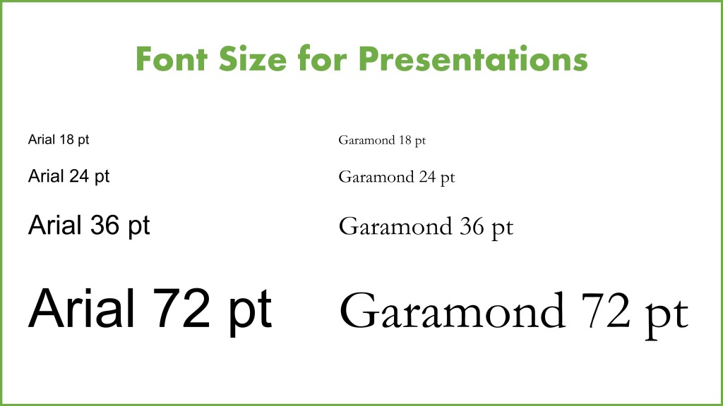
There’s no ideal font size. A readable font size choice will depend on the room and screen, as well as the font family, the contrast between font colors and slide background, and the audience demographics. That said, a bigger font is often the right choice.
3. Add animated GIFs
Animated GIFs add a dynamic element to your PowerPoint presentations. It isn’t just about eye candy. An animated GIF can deliver more information than a still image.
GIFs may also be a safer alternative to embedding an entire video in your slide deck. Because, as any experienced presenter knows all too painfully, video and audio playback in PowerPoint is prone to complete technical failure.
Add an animated GIF the same way you insert any image into PowerPoint. Since animated GIFs can be large files and could distract your audience, don’t overload your presentation with them. Use GIFs sparingly and strategically.
I regularly use animated GIFs when I give trainings and speak in front of crowds. Sometimes the animated GIFs are serious, showing a behavior or best practice I want to to discuss with attendees. Other times, I include animated GIFs in my PowerPoints to entertain my audience and help me be a more memorable public speaker.
For example, here’s the opening title slide from my most popular training:
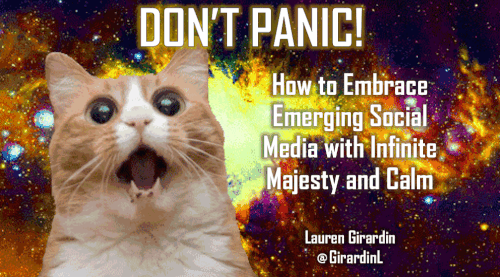
You don’t need to go as vivid as I did with my much loved and oft tweeted cat GIF. Even if your style is more demure, animated GIFs can add plenty of pizzazz to your PowerPoint presentations.
What are your secrets for more creating captivating PowerPoint presentations? Share your tips in the comments.
Lauren Girardin is a marketing and communications consultant, writer, and speaker based in San Francisco. She helps organizations and do-gooders engage their communities and tell their stories. Her website is laurengirardin.com and you can connect with her on Twitter at @girardinl.


These are good tips for making PowerPoint presentations more dynamic. I would caution against using GIFs because they are not accessible. Also, images used can be improved with Alt-text, so that all members of the audience can consume the information being presented. It is possible for presentations, especially those created and distributed by government to be both fabulous and accessible.
GIFs work like any other picturein PowerPoint. So, the good news is that you can add alt text GIFs in PowerPoint to make them accessible. Like static pictures, GIFs can also be used simply as illustrations alongside the slide’s main message text (like my cat), so no meaning will be lost if they are not viewable.
And of course, this only matters for distributed PowerPoints people will view on their computer. For live presentations where your slides are only going to be experienced projected onto a screen, you’ll want to adjust what you say to the audience. Alt text won’t help.
I like the suggestions provided except for the animated GIF. These can trigger seizures or other illnesses for members of your audience. I’ve found that I completely lose focus on the content because I have to avert my eyes to prevent myself from getting sick. I had to strategically scroll just to read this blog post and not get ill.
Thanks for your comment, Chris. I’m sorry to hear you have a sensitivity to moving images. It must make the internet, television, and movies difficult to enjoy. In case you weren’t aware, you can change your browser settings to disable the automatic loading of images so they don’t cause you discomfort.
I would like to offer more information about animated GIFs and seizures. Please note, I am not a medical professional, so this is NOT medical advice, just my understanding.
Not all GIFs carry a risk of triggering seizures. Animated GIFs are no more likely to trigger seizures in people with photosensitive epilepsy as the video the GIF is created from.
To find out if a particular animated GIF carries a seizure risk, use the University of Wisconsin’s Trace Center’s Photosensitive Epilepsy Analysis Tool (PEAT) http://trace.wisc.edu/peat/ to check the flashing frequency of the GIF. Federal agencies should also make sure they comply with GSA Access Board’s Section 508 Standards http://www.section508.gov/summary-section508-standards.
What is “Alt Text”?
Ditto
It stands for “Alternative Text”, which is essentially a description of the image to help people using screen readers understand the context of pictures or images. Microsoft offers guidance on how to add Alt Text in Office applications: https://support.office.com/en-us/article/Add-alternative-text-to-a-shape-picture-chart-table-SmartArt-graphic-or-other-object-44989B2A-903C-4D9A-B742-6A75B451C669.
Joel, your question inspired me to write an article all about why and how to use alt text in all kinds of digital communications, like websites, blogs, Microsoft Office programs, and social media: https://www.govloop.com/community/blog/how-to-use-alt-text-on-images-in-your-communications/
I think there on animated GIFs that are subtle enough not to trigger migraines, and agree that sparingly is better. I will often, depending on the subject, orient words in different directions or use arrows instead of bullet lists. If I’m less bored, so is my audience, as long as it doesn’t get “interesting” to the point of confusing.
“If I’m less bored, so is my audience.” That’s a great way to put it, Sandra!
O que é muito importante ,eu sou mais ou menos.Essas dicas me foram muito uteis.tenha a certeza que vou repensar a minha produção.
Estou feliz por ter sido útil, João.
(via Google Translate)
Great article, Lauren! I loved the GIF from the Office – a fave… 🙂
Thank you, Lacey. Any Michael Scott moment makes a great GIF, but that one in particular is one of my favorites, too!
Thank you. The PowerPoints that I have had to do in recent months are for courses towards a Masters. unfortunately, they do not want animation and a lot of flash. In fact, more than one professor has said they will penalize for that. Instead, they do want bullet points and they want things to the point.. They also don’t want GIFS, large fonts.
I believe PowerPoint’s should be targeted to your audience. I can understand your background and line of work most likely warrants. Great post!
Wow. I suppose I can see that doing PowerPoint that way is all about helping you learn to focus on organizing your presentation arc, presenting your facts clearly, and cutting out the fluff. There’s certainly a benefit in all that. But, information processing is often enhanced by visuals, so there’s a missed opportunity to improve the experience for the audience. It’s a shame that the learning doesn’t go further, but you’ll have a solid foundation.
That said, it sounds like you’re learning many useful things in those courses, JC. After you finish your Masters, I’m sure you’ll come up with your own PowerPoint style that can better enhance your presentations and your audience’s experience.
Thank you for sharing!
Thanks for sharing these interesting ideas. I intend to try them.
I’m glad to hear that, Linda. As you try these PowerPoint ideas out, please come back and comment if you have any questions or to share your success!