
In December 2009, the Open Government Directive established deadlines for federal agencies to make quality information available to the public, all in the name of greater transparency. Recovery.gov was one of the leaders of this open government charge, and was actually established in February 2009, ahead of the directive.
Today, there are a number of great dashboards, both those that encompass data from across many federal agencies, and those that are agency specific. Here, I highlight my favorites (in no particular order).
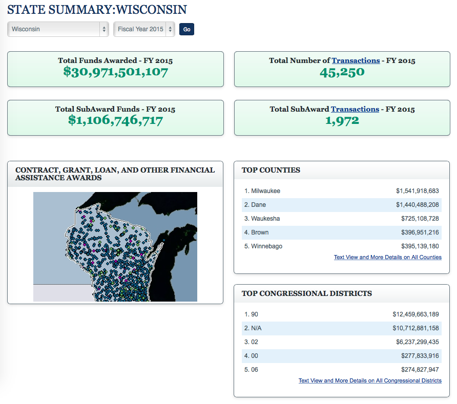
USASpending.gov: This mandated dashboard offers information on where their tax dollars are going. See funds awarded by state, recipient, type of payment (grant, loan, etc.), sort by Congressional district, awards made by agency, or even get ZIP code specific data. Data from FY 2008 to FY 2015 is currently available on the site, and you can use it to view spending trends.
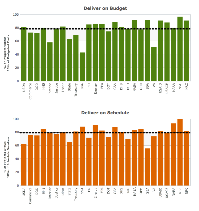
ITDashboard.gov: The federal IT dashboard includes data on per-agency spending, but it also digs deeper to offer graphical representations of how many projects were delivered on time and on budget. Data displayed on the website is pulled from USASpending.gov’s publicly accessible Federal Procurement Data System. In addition to being available for public consumption, the data on the website is used by the U.S. CIO to talk with agency CIO’s about IT investment, underperforming projects, and future plans.
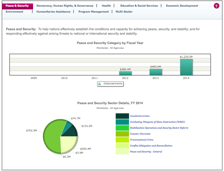
ForeignAssistance.gov: If you want to know where our foreign aid goes and how it is spent, this dashboard is for you. Data can be viewed by office, recipient/region, sector, agency, Overseas Contingency Operations, or PEPFAR (AIDS relief). Beyond that, you can see which of the funds are allocated for peace and security, democracy, health, humanitarian assistance, education, etc.
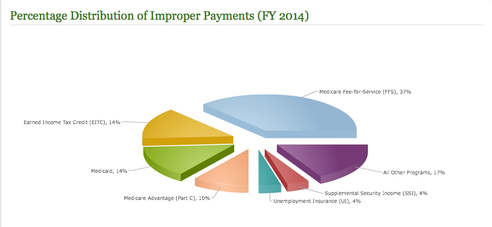
PaymentAccuracy.gov: So now that you know where the money goes, how accurate are those payments? The Payment Accuracy dashboard tracks, by agency and program, the improper payments made by the federal government. You can sort the data by year, over and underpayments, high-error programs, recaptured payment errors, and agency.
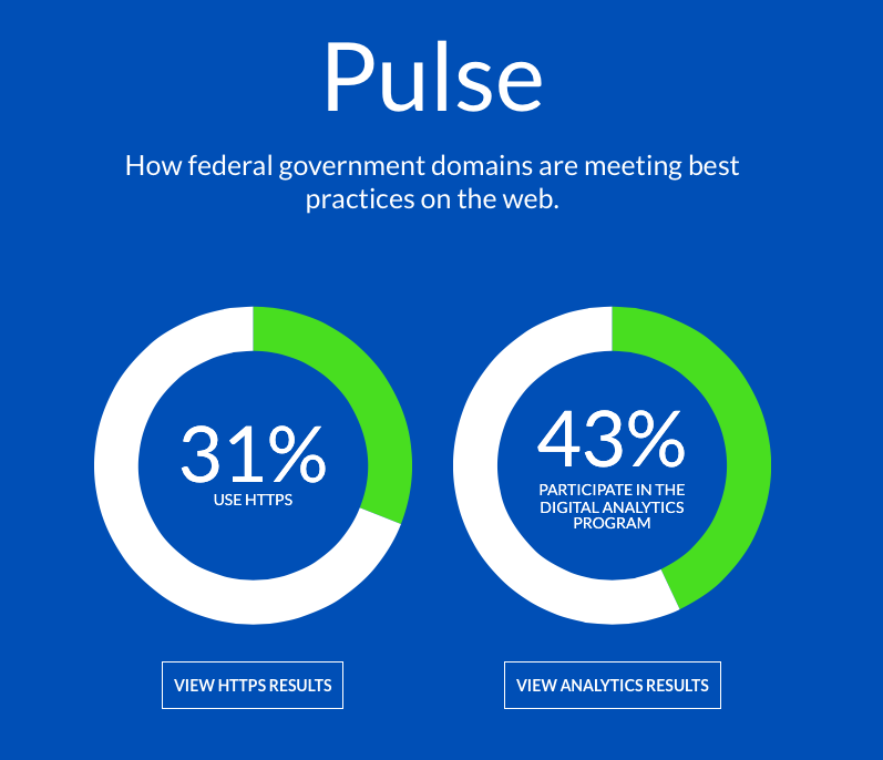
Pulse.cio.gov: The newest of the federal dashboards, Pulse was created by the 18F team and its Office of Governmentwide Policy with the aim of monitoring best practices of some 1,300 .gov domains. The simple dashboard tracks the security of federal domains by determining which are using HTTPS protocol and which are using the Digital Analytics Program (DAP). While the data is currently somewhat limited, the 18F team hopes that it will eventually help to transition all federal agencies to these stronger security standards.
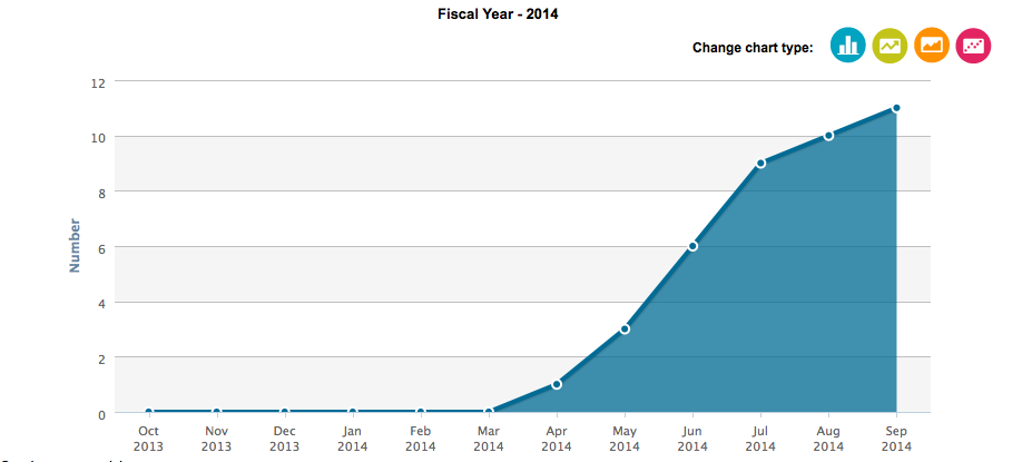
FDA-TRACK: FDA uses the data on its website both for public consumption and internal management. Many of the FDA’s program areas have their own dashboards, and they contain information ranging from tobacco retailer enforcement permits to number of FOIA requests received each month and warning letters issued by the Center for Veterinary Medicine. Data goes back a number of years to allow for trend tracking.
USPTO Data Visualization Center: USPTO recently updated its dashboard, and it just looks cool. Instead of relying solely on the bar graphs, it employs speedometer graphics to depict application backlog, pendency data, and quality. More detailed information is available using links on the homepage, which directs users to breakdowns in various categories, each of which includes a description on what is depicted. 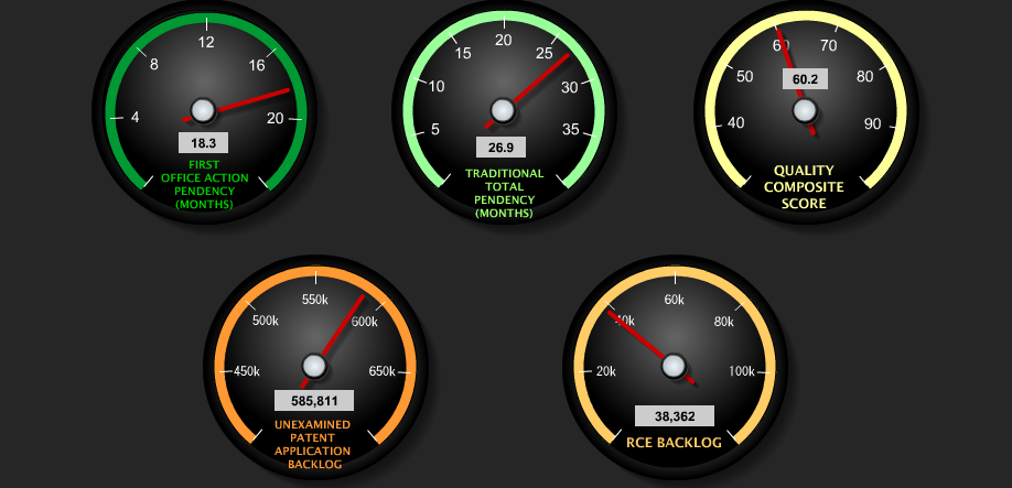
Do you have any favorite government dashboards? Leave them in the comments.


No list of “cool dashboards” should include a 3D pie chart (let alone a 3D exploding pie chart) – they are an affront to analytics.