![]()
When the Census Bureau first embarked on its digital transformation, we examined customer feedback and web analytics that looked at how users were navigating Census.gov. Both sources of information told us our site wasn’t user-friendly.
We realized that to meet our customers’ needs, we had to stop looking at the website through our own eyes and start looking at it through the eyes of a user.
There are three major ways we made Census.gov more user-friendly through principles that can be applied to any government website. I’ll walk you through the thinking behind each, using Census.gov personas to show how thinking like a customer makes a world of difference.
Intuitive Site Navigation
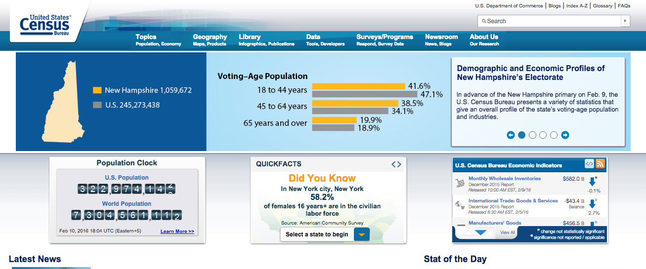
Every website, starting with its homepage, needs to reflect how its visitors think and what they want to get out of each visit.
Take for example, Jeremy, a student whose teacher recommends he go to Census.gov to get information for a project about the people living in his county. All Jeremy knows about the Census Bureau when he starts his project on Sunday afternoon is that it counts the population every 10 years. He’s never visited the Bureau’s website before, and the project is due tomorrow.
What he finds on the homepage is everything he needs to finish his project. At the top of the page Jeremy navigates to the menu bar and clicks on the “Topics” tab. There, he’s shown the latest reports, data and visualizations on various topics — such as age and sex, ancestry, and children — to tell his county’s complete story.
Smart Search
How powerful and helpful is your agency’s search function? Americans are used to having any question that crosses their mind answered by search engines like Bing or Google. So it’s not enough anymore to provide lists of opaque links. When people search for something on your website, they expect to be able to find it right away.
The new approach to searching on Census.gov works for customers like Kim, who is moving to the Midwest with her husband to start a family. Where’s the best place for them to live? Kim goes straight to the source at Census.gov.
She types into the search box a state she’s considering. Along with links to various articles, graphs, and charts, a box that summarizes state facts appears on the side of the page — including the state’s most recent population estimate, median household income, and its residents’ educational attainment.
With a few quick searches on other states, Kim and her husband have the information they need to help them make the best decision for their future family.
Digestible Data
Many government agencies produce a lot of data. It’s easy to forget that not everyone can use it the way we can, much less understand it. On Census.gov, we reworked the way we present data. We stepped away from restrictive tables and created a more visual and interactive experience for our non-expert customers who need data, but don’t have the time to analyze it.
An example is Andrew, who regularly meets his buddies after work to talk about current events. Last night’s topic was the job market. To show the group the latest figures on the growth of jobs in the United States, Andrew went to Census.gov and made his way to Infographics. There, he found a sea of digestible images that provide a peek into the economy.
At the end of the day, at any government agency, our work is shaped by our customers — America’s taxpaying public. When we make digital changes, we want everyone to feel a personal connection to what they’re looking for and how it’s being presented to them. That alone can truly enhance the experience of interacting with the federal government for any user. When we’re given feedback, we must aim to integrate that input into future iterations of our digital enhancements. Doing so is not just user-friendly: it’s customer-centric.
Stephen L. Buckner is part of the GovLoop Featured Blogger program, where we feature blog posts by government voices from all across the country (and world!). To see more Featured Blogger posts, click here.


Thanks for sharing this post! It’s great hearing about how government sites are focusing on their users. To create these personas, did you look at user feedback, demographics, site analytics? What are the best ways users can communicate their needs to an organization?
Great question, Sonia. We will be diving into this in the next few posts. Stay tuned.
I really enjoy that government site are becoming more user-friendly. I appreciate how they simplify data and easy to navigate. Thanks for posting!
As a researcher, having digestible data easily available is key! Very good point. Thanks for posting!
It’s amazing to see and feel how our website has evolved so much in the past 5 years towards this customer-centric vision. It has been very beneficial to my work!
It certainly has changed, Alexandra. Glad it is improving how you do your work.
Thank you for the info. I try to get info and complete tasks on line whenever I can but some websites are more concise and better set up than others. This was a hopeful indicator to me that someone out there actually cares to make it user friendly
Thanks for the feedback, Toni. The customer-centered approach is a major component of the Census Bureau’s digital transformation. We’re dedicated to ensuring our users have a great experience online.
Very concise and clear posting to explain customer friendly websites. The intuitive explanation of a website is crucial to helping the site fulfill its goals for the organization. Well organized and presented presentation.
Thank you, Richard.