
![]()
If there is one thing we have in government, it’s data. And if there is one thing that our government leaders like to do, it is talk about data, specifically how we are data-driven organizations and using performance measures to improve the way we provide services to the public. Data and government go together like…peas and carrots, chocolate and peanut butter, Laverne and Shirley, choose your favorite pair!
Unfortunately, I have bad news for you. Most people find data really, really boring. Really boring. That means that our charge is to figure out the story behind the data and communicate it in a compelling way.
Find the Right Data.
Identify the relevant and compelling data that supports the story you’re telling and ignore the rest. Governments are notorious for spraying data at residents like a sprinkler watering lawn: consistent, relentless, droplets of data to cover every nook and cranny of public service. In reality, only certain points of data are truly valuable in communicating your main point.
Share the Good, the Bad, and the Ugly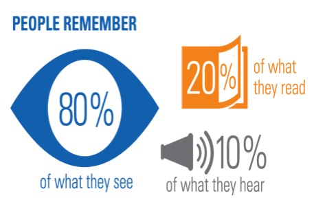
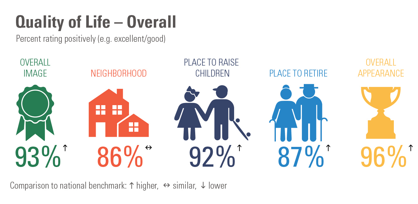
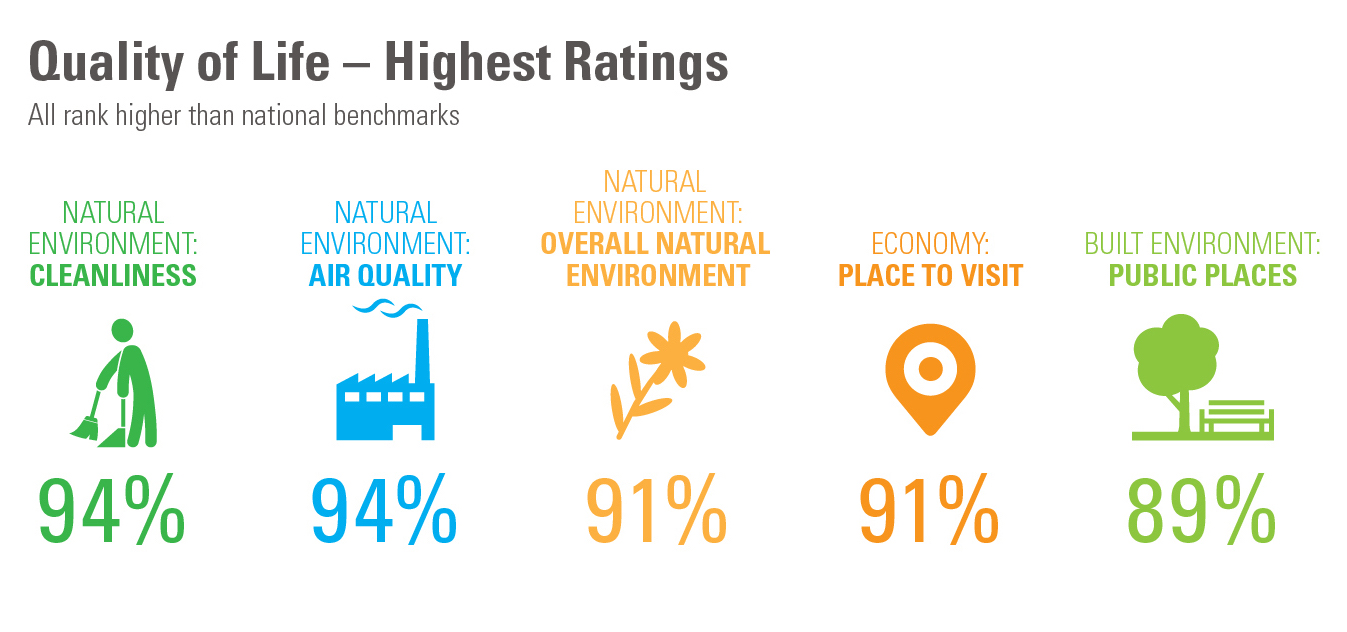
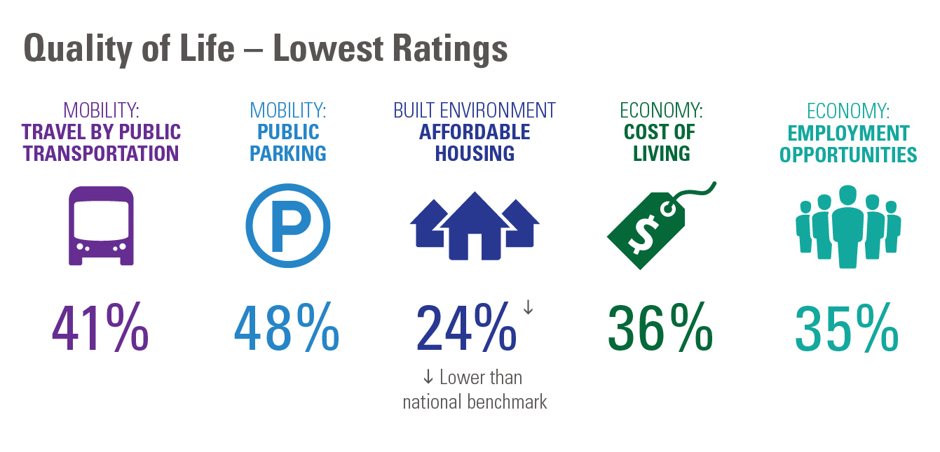
Resist the temptation to censor your data to paint an overly positive picture. Sharing both favorable data (93% of residents rate our Quality of Life as good or excellent) and areas for improvement (15% of residents are satisfied with our snow removal services) exemplifies transparency and increases credibility. It gives you an opportunity to share your plans for improvement. And, when appropriate, it helps make an argument for the need for additional funding.
Context is King
Stand alone data is confusing. Most residents couldn’t tell you what PCI stands for, let alone what constitutes a good score. Remember, your audience does not have the history and detailed knowledge that you do. Help them understand the context and value of data by using simple language, sharing comparable benchmarks, and showing year over year changes.
Data Visualization – Infographics
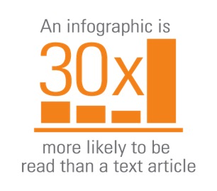
Humans are visual beings. Increase your odds of residents understanding and remembering your data by using infographics.
 Keep the Design Simple. The intention is to clearly and quickly get to the point, not to create intricate illustrations. Crisp, clean, easy to understand – that’s your goal.
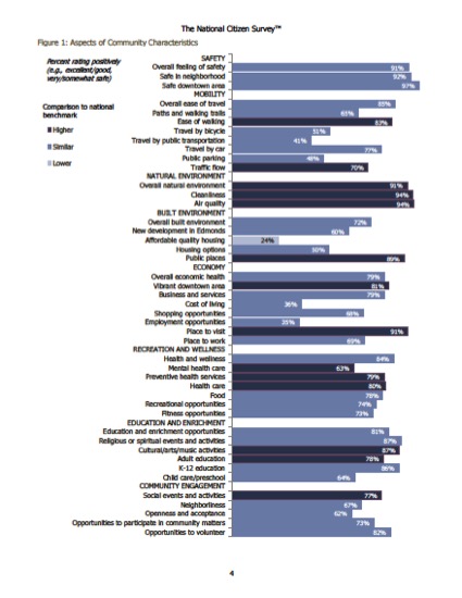
No Clip Art. My unnatural, yet very deep, hatred of clip art is well documented. Clipart makes your work look unprofessional. It screams, “I don’t care enough to try any harder than cut and paste!” Just don’t use it, please.
Now, I’m not naïve enough to think that you’ve read this entire blog. So with that, I’ll leave you with some before and after images of how data visualization can help make data more engaging and easier to understand.
Before
After
Kim Newcomer is part of the GovLoop Featured Blogger program, where we feature blog posts by government voices from all across the country (and world!). To see more Featured Blogger posts, click here.


Leave a Reply
You must be logged in to post a comment.