
The federal government spends almost $500 billion a year on its contracts, and nearly $4 trillion overall — numbers so large that they’re almost abstract in size. It’s obviously a lot of money, but for citizens who are interested in what the government is spending, it can be hard to wrap their heads around that amount or what it might be going toward.
It was with those curious citizens in mind that that the Treasury Department’s Bureau of the Fiscal Service launched the beta version its new data visualization and analytics site, DataLab.USASpending.gov on Wednesday.
Taking into account user’s needs and requirements of the Digital Accountability and Transparency Act (DATA Act), which requires federal agencies to report financial information every quarter in a standardized way, the team behind the Data Lab decided to present the wealth of federal spending data in a visually-friendly and easy-to-manipulate way.
Justin Marsico, a senior policy analyst at the Treasury Department leading the analytics team working to meet the requirements of the DATA Act, explained the work and thought that went into DataLab.USASpending.gov at a recent FCW citizen engagement event.
“Our mission was to discover insights within federal spending and encourage others to do the same,” he explained. “We wanted to explore visualization and tools the public could use and lead by example within the government.”
Doing so was a gargantuan effort, one that took multiple years, 91 agencies submitting data, and a team to test, work with end users, and eventually launch the site.
The result is a sleek, colorful site full of a variety of data visualizations that allow users to delve into data analytics about everything from which contractors each agency spends the most with to federal funding for particular community programs across the country.
Marsico walked the audience through three particular types of data visualization that the site employed to engage citizens about federal spending data.
#1: Federal Accounts Dendrogram
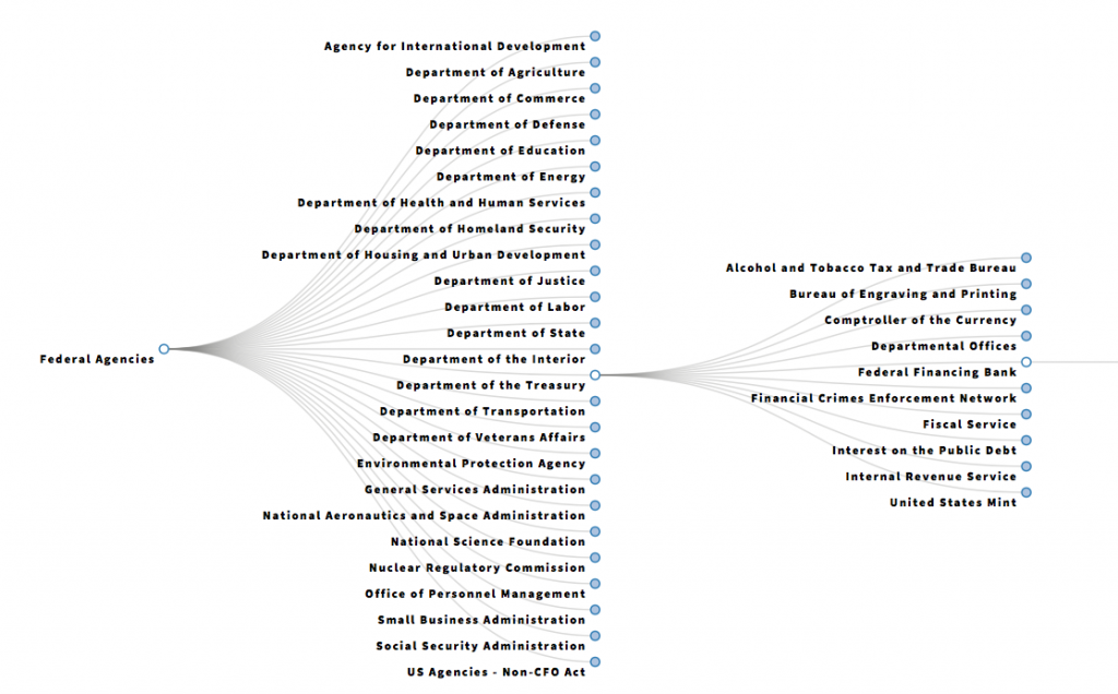
A dendrogram is a tree diagram that shows taxonomic relationships. The Data Lab site’s dendrogram details an all-in-one view of federal accounts that the government uses to spend money and how each agency’s accounts are organized. The first branch of the diagram shows agencies, the second shows sub-agencies and the third shows the federal accounts.
#2: Federal Contracts Sunburst Data Visualization
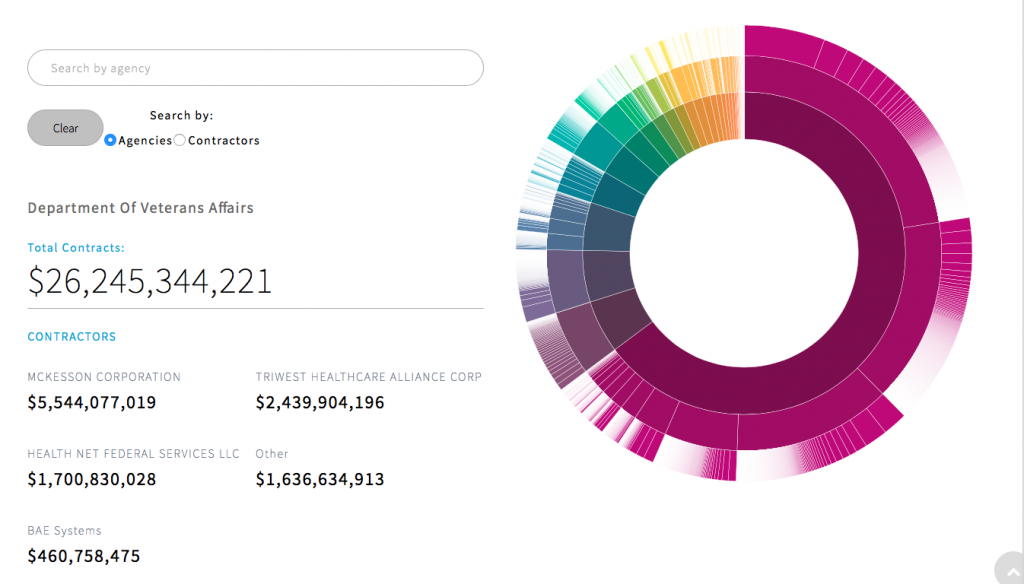
A sunburst diagram or chart is a multilevel pie chart used to represent the proportion of different values found at each level in a hierarchy. For the Data Lab, they turned to a sunburst diagram to categorize and explore contract-related information for fiscal year 2017, including which organizations received federal contracts, amounts, awarding agencies, sub-agencies, and types of goods or services contract recipients provided to the government.
The site explains how to use this sunburst visualization: “The diagram has three rings. The inner ring represents federal agencies, like the Defense Department, which are sized by the total dollar amounts they spent on contracts in FY 17. The middle ring represents sub-agencies, like the Air Force, which in most cases actually award contracts to contractors. The outer ring represents the contractors who receive awards from those sub-agencies.”
#3: Cluster Analysis
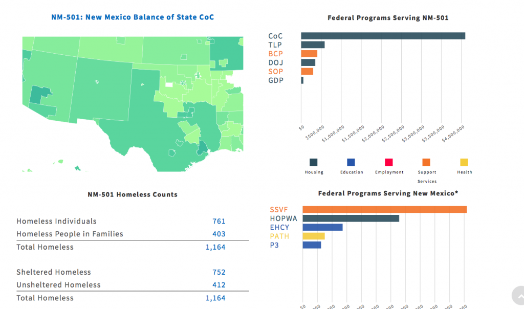
A cluster analysis is a model that assigns observations to groups so that observations within each group are similar to one another with respect to variables or attributes of interest. The Data Lab chose to analyze data around homelessness funding across the United States. The hope is that centralizing this sort of data could help cities and counties learn from the others about funding and programs they were doing around homelessness. “We chose to conduct this analysis because it features data from across multiple federal agencies, which is all available in one dataset,” the site noted.
There are a variety of other datasets and visualizations throughout DataLab.USASpending.gov, and Marsico said the next step is to sign up user groups for further testing and feedback before a formal launch.
“We really want to let the user take their own self-directed journey through our data to get them excited and educated about what government does,’ Marsico concluded.


Leave a Reply
You must be logged in to post a comment.