
See where your city’s transportation ranks on a list of the best and worst metro areas in the U.S. — and what levers your planners can move to improve your city’s climate stance.
In 2020, many cities moved quickly to adjust transportation infrastructure to help constituents and businesses. They closed streets to vehicles, opened sidewalks for restaurant seating, and adjusted parking options for delivery services. City governments should incorporate this “rapid planning” stance long-term, as transportation technology, behaviors and economics will continue to evolve rapidly.
Remote work opens up the possibility of reduced commute driving. Reduced travel distance and low-carbon travel modes could lower emissions by nearly six metric tons per year, according to the Emissions Gap Report 2020. And as offices reopen, if companies permanently adopted a one-day-a-week work-from-home policy, it could reduce their commute vehicle miles traveled (VMT) by 20%
Given the potential for decoupling economic growth from VMT, now is the time to create more financial and other incentives for reducing climate impact. Building that into economic recovery is the best way to take advantage of short-term gains made during COVID-19 travel shutdowns.
StreetLight Data is a data analytics company that uses geospatial (GIS) data to transform urban planning and transportation design. Its 2020 U.S. Transportation Climate Impact Index analyzes transportation factors affecting greenhouse gas and ranks the 100 largest metro areas in the U.S. from best to worst.
The list also includes rankings by each factor: vehicle miles traveled, bike and pedestrian travel, transit travel, population density and circuity. Agencies can use this data for transportation planning efforts.
How each factor is ranked:
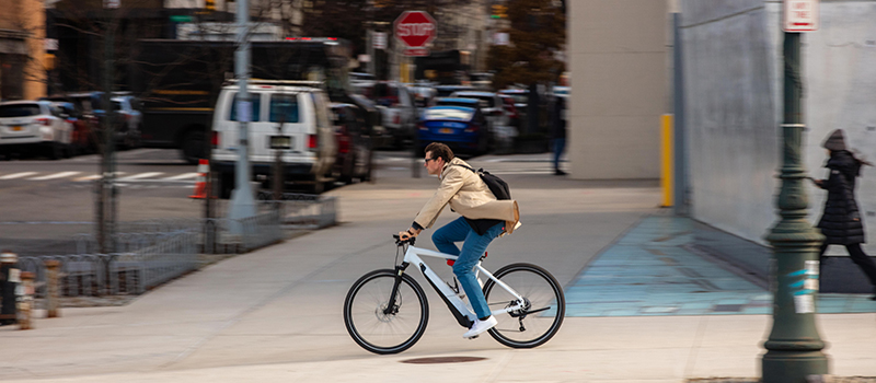
- Bike Rank – This is based on bike miles traveled (BMT), replacing daily driving with an eco-friendly mode can make a significant dent in a city’s emissions. StreetLight Data analyzed bike commutes in particular: peak morning trips originating from home locations and ending at work locations, and peak afternoon trips originating from work locations and ending at home locations.
It’s best to have a high bike ranking.
- Pedestrian Rank– Based on pedestrian miles traveled (PMT). Streetlight Data analyzed pedestrian commutes similarly to bike commutes but bike commutes are likely to be longer than walking commutes, so they would likely replace more miles traveled by car.
It’s best to have a high pedestrian ranking. - Transit Rank– Transit infrastructure is expensive to build and maintain compared to adding bike lanes. Because not every city has the resources or demand for a robust transit system, Streetlight Data weighted this less than bike and pedestrian commuting.
It’s best to have a high transit ranking. - Population Density Rank– The number of residents per square mile of the metro area. Densely populated cities have residential locations close to commercial and work areas. People who live near their regular destinations are more likely to take transit, walk or hop on a bike as a reasonable alternative to driving. Less dense cities sprawl ever outward, forcing residents to turn to cars for longer trips.
The top-ranking metro areas have high population density compared to their fellow metro areas. - Circuity Rank – A city with high circuity means drivers are taking “the long way around” to get where they want to go, maybe even circling to find parking spaces. Transportation network service activity (ride-hailing services) can also contribute to high circuity, as drivers cruise around waiting for customers, and driving to pick them up.
The lower a city’s circuity, the more efficient its travel patterns are. - VMT Rank – Based on vehicle miles traveled (VMT) per capita, the more miles a vehicle travels, the more emissions it produces. A high VMT is a bad thing for transportation emissions.
It’s best to have a low VMT.
Red = a low ranking is best
Green = a high ranking is best
The index gives insights into which initiatives contribute to a metro area’s ranking, which actually waste valuable resources, and how the COVID-19 pandemic changed cities’ transportation climate impact in 2020.
This article is an excerpt from Streetlight Data’s 2020 U.S. Transportation Climate Impact Index. Download the full index, for the entire list of the 100 largest metro areas in the U.S. from best to worst here.


Leave a Reply
You must be logged in to post a comment.