

![]() Technology and screens have become a constant fixture in our daily lives. In fact, you’re reading this article on a screen right now. We are dependent on how we navigate these technologies. And how we interact with and experience a product, system or service has become a much bigger deal. We can tell the difference between a digital interaction that’s user-friendly and one that’s not, yet many of us struggle to articulate why something might be difficult to use. To pile on, unfortunately, in government, there are plenty of clunky systems.
Technology and screens have become a constant fixture in our daily lives. In fact, you’re reading this article on a screen right now. We are dependent on how we navigate these technologies. And how we interact with and experience a product, system or service has become a much bigger deal. We can tell the difference between a digital interaction that’s user-friendly and one that’s not, yet many of us struggle to articulate why something might be difficult to use. To pile on, unfortunately, in government, there are plenty of clunky systems.
Improving our government systems depends on our ability to provide feedback on why our systems fail us, from the internal portal we use to update our time cards to the customer-facing portal of applying for a benefit.
Usability heuristics can help provide the understanding and a common language for when something is hard to use or not intuitive.
Heuristics are tools to help someone learn for themselves. They can be useful as rules of thumb and great to leverage when giving feedback on a system. The 10 usability heuristics in this article are some of the most used, but there are also many others.
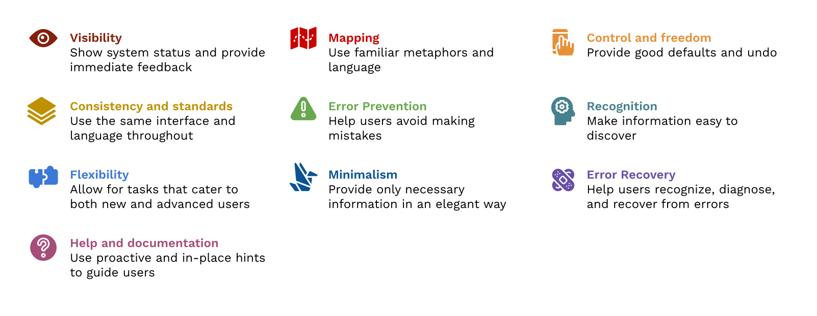
1. Visibility of system status
Have you ever pressed submit on a button and nothing happened? It probably left you wondering if you should click submit again or if your internet went out. This heuristic states that the system should always keep users informed about what is going on, through appropriate feedback within a reasonable amount of time. An example of this would be the screen changing to “Loading…” after you press the submit button, giving you immediate feedback on what the system is doing.
2. Match between the system and the real world
A lot of the patterns that we see on our phones, tablets and computers match the real world. We use the trash can icon to represent deleting files, the calculator icon looks like a calculator, and we use folders to keep our digital files organized. This heuristic states that the system should speak the user’s language with words, phrases and concepts that are familiar to the user.
3. User control and freedom
Have you ever deleted a file by accident and were unable to retrieve it? This heuristic states that when users make a mistake, the system should allow them to fix it. Examples of this would be the ability to recover accidentally deleted files, undo the last action, exit a screen at any time, and see pop-ups that ask you to cancel or proceed.
4. Consistency and standards
A website or system should have a consistent look and feel. When they don’t, users are often confused and question if the information presented is trustworthy. This heuristic states that systems should maintain consistency and follow established industry conventions and patterns. For example, copy and paste functionality works the same everywhere. Look to other systems for common patterns instead of reinventing the wheel and confusing users.
5. Error prevention
The best designs prevent users from encountering a problem in the first place. Rather than having a good error message, this heuristic states that you should prevent error-prone conditions. For example, instead of showing an error, prevent users from entering letters in a field for phone numbers.
6. Recognition rather than recall
Have you ever been presented with a wall of text on one screen that was required information for another screen? (I have experienced this on too many government websites.) This heuristic states that you should minimize the user’s memory load by making objects, actions and options visible. A good system should present all the information required to make a choice when needed. For instance, a lot of e-commerce websites show recently viewed items to help you remember what you may have been searching for beforehand, instead of you having to recall the last time you were on their site.
7. Flexibility and efficiency of use
Systems should be user-friendly for both new and advanced users. This heuristic states that a system should cater to both inexperienced and experienced users. How many times have you used a new system and were immediately overwhelmed by all of the options available on the screen? The Microsoft Word toolbar does a good job of allowing for flexibility and efficiency of use. As a user, the toolbar has everything you need to create a word document and doesn’t overwhelm you with too many advanced options. Alternatively, there are multiple keyboard shortcuts and customization options available if you’re more advanced.
8. Aesthetic and minimalist design
Less is more. This heuristic states that systems should only contain the most essential information and elements. For example, Google’s search page is very minimal compared to Yahoo’s. Google’s search bar is front and center while Yahoo’s is harder to find, given all of the information on their page.
9. Help users recognize, diagnose and recover from errors
Have you ever gotten an error message on a website or system but had no idea what it meant because it was an error code? This heuristic states that error messages should avoid technical jargon, indicate the problem and suggest a solution. For example, instead of presenting a 404 page, which is the error for a page that can’t be found, let the user know that the page they were looking for couldn’t be found and offer them the ability to return home or search for the page they’re looking for.
10. Help and documentation
Systems should strive to stand alone without any required instructions to use it. However, what may be easy for one user might be difficult for another. This heuristic states that documentation should be provided to help users understand how to complete their tasks. For example, provide the most commonly asked or searched for help topics up front so if the user is encountering a common issue, they can immediately resolve it.
Conclusion
While these usability heuristics can help us articulate and express feedback, I recommend using them as a starting point. Sometimes an interaction that might not be user-friendly will require more in-depth analysis and a professional product and user experience designer, who is often a usability expert, to take a look. However, knowledge and awareness of these usability heuristics can help us design better digital products and services for the people who need them most. We can let our tech teams know what we want improved, what works, and what doesn’t work, and we can start to expect more from our government systems.
Interested in becoming a Featured Contributor? Email topics you’re interested in covering for GovLoop to featuredcontributors@govloop.com. And to read more from our Winter 2021 Cohort, here is a full list of every Featured Contributor during this cohort.
Jenn Noinaj is a social impact strategist, researcher, and designer passionate about using design to solve society’s most pressing challenges. She’s currently leading the Public Interest Technology Field Building portfolio at the Beeck Center for Social Impact + Innovation where she works on creating solutions to make the public interest technology field more inclusive. Prior to this role, she worked in the federal government at the US Digital Service where she partnered with various agencies to transform digital services across government, building capacity in technology and design and championing a user-centric culture. You can find more about her on her website and can follow her on LinkedIn and Twitter.


Leave a Reply
You must be logged in to post a comment.