
New logos are far from easy. Government agencies may feel like they have it easier than global brands are so closely tied with their logos. In our online, social, attention-strapped world, a strong, memorable logo can help an agency connect with constituents, gain credibility, and accomplish its goals.
A well-conceived, beautiful logo and a thoughtful process that makes stakeholders feel heard can be expensive and time-consuming. A cheap logo design or a rushed process that doesn’t consider your agency’s full brand or the diverse needs of your constituents will rarely last, requiring your agency to go through the laborious logo process all over again.
Let’s look at some of the biggest logo flops by government agencies in the U.S. and discover what you can learn from what they got wrong.
Tennessee State Government logo
Tennessee’s new “little red square” logo has recently been criticized for being too costly at $46,000 and too simple. A persistent watchdog reporter broke the story. People surged to Twitter to express their dismay using the hashtags #SavetheTristar and #TNlogo as well as with a petition. Loccal reporters investigated how the logo happened and national media picked up the story. Graphic designers came to defense of the cost and results. Politicians jumped on the bandwagon. A conservative think-tank named it “Pork of the Year.” Parody videos were made. Citizen criticism raged about how little meaning the two-letter postal code, “TN,” has for state residents.
State officials have defended the design, saying that it was important to replace the state’s 172 different logos with a consistent brand identity—and that the logo won’t replace the state flag, its famous “tristar,” or the state’s official seal. The design agency, GS&F, also openly shared their process to create one logo that could work across state agencies. The controversial logo is already in use, including on the state’s website and social media.
The story and finger-wagging is far from over. Politicians are calling for a refund. And, the state has only partially accomplished what it set out to do: the U.S. Patent and Trademark Office rejected the trademark application for Tennessee’s logo for being too generic, which was pretty much everyone’s problem with it. The state says it will appeal.
City of Philadelphia logo
The City of Philadelphia is lucky it debuted its logo in 2009, before social media could really turn a few grumbles into a national media story. The city’s troubled logo is the result of two factors: one, design by committee and two, work done for free.
The first slam came from Kosal Sen, an art director writing for Brand New‘s design blog. Calling the logo “boring” and the typography “thoughtful for its accessibility” yet “amateur” wasn’t enough. The real ringer is his last paragraph:
Besides the technical problems with the drawing, the bigger issue is that this logo fails to deliver any emotional or cultural connection. For rebranding a city, these connections are paramount. Without it, we’re left with the same old brand image that any big city suffers from; a festering stew of corruption, bureaucracy, and half-assed government initiatives. And that’s exactly what this logo is a reminder of. Hey, at least it cost us nothing.
Sounds harsh, but when you read his design analysis it’s not all that unfair. Brand New later dubbed the City of Philadelphia’s logo one of the worst
Fast Company called it a “design crime” and mocked those making excuses for the logo fail. A company that connects technical communities ran a design contest for a better Philadelphia logo. Explaining that the city decided that it needed a new logo because it needed to “establish a unified voice for all Philadelphia departments and projects,” reporter David Boyer for the Philadelphia Inquirer joked, “If a logo can get everyone at City Hall working from the same page, it will be a magic logo indeed.”
NYC Taxi logo, 2007 version
Anyone who’s done a design project is forever haunted by client requests like: “Could you make it pop more?” and “Can you make the logo bigger?” That same flawed feedback style led to one of the more recognizable government logo flops.
To celebrate the 100th anniversary of the NYC taxicab and to bring more “uniformity” and a “branded experience” to the 26,000 cab fleet, the bright yellow cabs got a new logo in 2007. It didn’t go well.
Battered by the full fury of New Yorkers with a grievance, the design agency, Smart Design, admitted that their original simpler design had become an iterative change nightmare after they gave in to feedback from the NYC Taxi & Limousine Commission. They took the “flak” for all the negative press, including the spotlight from a much-read week-long series in The New York Times in which eight designers critiqued the logo. (Worth a read.)
In 2012, the city’s Taxi and Limousine Commission had apparently learned to listen to its design agency (miraculously still the same one) and the NYC Taxi logo was revamped yet again and welcomed with much less hand-wringing.
The Smithsonian’s Department of Innovation
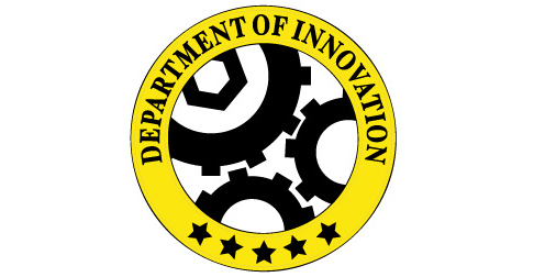
Don’t let anyone try to convince you that the logo for a smaller part of your agency doesn’t matter. If they’re stubborn about it, show them this example.
Back in 2011, the Smithsonian Institute launched a new blog, the grandly titled “Department of Innovation.” Critics of the logo — and there were many — didn’t fuss over the stinging bright yellow or much care that there isn’t a real federal department responsible for the uber-trendy innovation.
Instead the Smithsonian’s fanbase, high on the nerd level in their technical and science knowledge, quickly figured out that the three interlocked gears couldn’t turn. The logo fail was rumored to also have inspired the fixation of a crowd of government haters. The logo was held up as a symbol of government’s “pretense of entrepreneurial expertise” and “a perfect analogy of today’s government!”
The Smithsonian quickly tweaked the logo so the gears weren’t so close together. A few months later, it changed the logo and the name of the blog to simply “Innovation.”
Lauren Girardin is a marketing and communications consultant, writer, and trainer. Find her on Twitter at @girardinl.


Leave a Reply
You must be logged in to post a comment.