HR data dashboards can prove instrumental in quickly analyzing a large complex workforce, enabling users to efficiently identify the most pertinent information embedded in large databases through visualization. According to the Society for Human Resource Management (SHRM), HR dashboards can effectively combine data from multiple sources to make sense of the broader human capital picture. Combining databases that track employee departures with employee satisfaction, and presenting the data visually, can help identify some of the root causes of employee turnover.
Data Dashboards at GSA
At the U.S. General Services Administration, analysts in the agency’s Human Capital Analytics Division have leveraged data visualization technology to create a dynamic, highly customizable internal HR data dashboard, called the GSA HR Business Partner Report (BPR). GSA’s BPR combines HR data from several of the agency’s databases to create color-coded graphs, charts and plots that summarize the agency’s key HR metrics. The GSA BPR, rolled out in late 2014, has provided important benefits to agency leaders, including empowering management to analyze employee data to identify trends or patterns over time, compare employee characteristics or outcomes across different workforce and mission critical segments, and measure return on human capital investments.
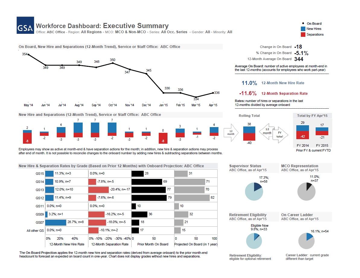
The GSA workforce dashboard provides a broad visualization of the GSA workforce through a variety of customizable charts, graphs and tables presenting different HR metrics.
How GSA’s Business Partner Report Paints a Picture of Organizational Change
Rachel Sullivan, a Management Analyst with GSA’s Human Capital Analytics Division, who helped develop the BPR in 2014, explained, “The GSA Business Partner Report provides visualization of what the GSA workforce looks like: composition, structure, and distribution by grade, reporting region, and staff office. It really helps us understand our workforce , not only currently, but over the past few years, to make some comparisons to the present day.”
Just as the SHRM report explained, HR dashboards at GSA combine data from various sources to draw wider conclusions. “The dashboard identifies who is moving in and out of the GSA workforce as well as promotions up through the grades,” said Sullivan.
Creating Compelling Visuals through Minimalism and Consistency
In visually designing GSA’s dashboard, the views, colors and charts were deliberately chosen and placed to maximize the impact of the data conveyed and ease the understanding of the visualizations. Paul Tsagaroulis, GSA’s Director of Human Capital Analytics, explained how GSA incorporated the minimalist techniques of information design pioneer Edward Tufte in designing the Business Partner Report, such as building consistency throughout the report and ensuring that each graph and color imparts specific meaning to the viewer.
“We use a similar color to flag a target group—such as gender, race/national origin, disability—for visualization purposes. Throughout the report, we used one color to talk about a new hire, one color to talk about a separation. We looked at how to organize content, and strategically placed the most important item depending on the format of the page,” explained Tsagaroulis, “Slides about hires and separations are structured the same across multiple pages. When people are flipping from one page to the next, they don’t need to relearn the formatting. We also minimized the number of labels and axis lines so we wouldn’t overwhelm the page with unnecessary data points.”
Helping Staff Use the Dashboard
When the BPR was first rolled out, GSA provided practical training on how to best use the new product, explained Sullivan. “We held a couple of training sessions, and people who had access to the report were invited to attend, and we walked them through how to access and navigate the report, apply the filters, and print the report. We also prepared a step-by-step job aid that takes the user through the process from start to finish.
The Data Dashboard’s Business Impact
GSA’s HR data dashboard has several built-in global filters that enable end-users to isolate the most pertinent data for their needs, greatly enhancing the flexibility of the dashboard. Users can filter the data using Tableau Reader by geography, agency subcomponent, job series, and demographics.
“We are publishing one report for GSA and the filtering allows people to drill down to the views they are responsible for reporting. It creates a common language for reporting on the workforce,” said Tsagaroulis, “People don’t have to request data, instead we developed a tool that publishes data for reference, and are developing analytical expertise in the agency. We are teaching HR representatives how to search for the data and empowering them to respond to questions about workforce data. Now we can focus on the more complicated requests because we’ve freed up resources through the Business Partner Report.”
Using the Data Dashboard as a Platform for Predictive Analytics
As the GSA BPR moves the agency towards a more analytical approach to managing its workforce, the data dashboard has become a platform for forecasting future human capital needs. “The dashboard is explaining what is currently happening and we are continuing to expand on that,” said Tsagaroulis, “We can use the dashboard data to build out models to do predictive and forecasting work, because we have good structure around explaining.”
Tsagaroulis explained how the agency is in the process of developing predictive regression models to forecast employee retirements and turnover to incorporate into the dashboard, and evaluating how workforce trends influence the agency’s effectiveness. “The Business Partner Report is the foundation, but not the end. Now we can start looking at the effectiveness at our workforce in terms of performance, productivity and workload,” added Tsagaroulis. The new metrics linking employee performance and productivity, as well as the projections on employee turnover from regression, are next for the dashboard.
In next week’s post, I will cover how end-users of the GSA dashboard have used it to generate measurable business improvements, and by extension, better serve GSA’s customers.
Matthew Albucher is part of the GovLoop Featured Blogger program, where we feature blog posts by government voices from all across the country (and world!). To see more Featured Blogger posts, click here.