
Like this …
Sample Twitter reaction ‘IT ROCKS!’
I am reminded of the Mac o/s interface though :] (which, woods’n’trees, apparently hadn’t crossed their minds).
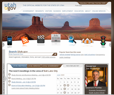
Immediately appealing, the just redesigned utah.gov site has very strong usability – this was the central aim of the redesign. Behind the scenes it makes use of – I think unusually – a wiki as a platform for adding and maintaining new content.
It aggregates 27 blogs, over 100 Twitter accounts (separately, they are building a Twitter aggregator), a Flickr group and more than 120 online videos. It has a successful 24/7 chat feature which was launched last year and this success has already resulted in the closure of state offices on Friday due to web redundancy.
The state of 2.7m inhabitants outsources it’s web work. Utah.gov is managed and operated without tax funds through a public-private partnership between the state and Utah Interactive, the Salt Lake City-based official eGovernment partner for the state of Utah. Utah Interactive is a subsidiary of eGovernment firm NIC, Inc.
The new site has a full tool set, including, I was very pleased to see, widgets such as ones for the latest sales available online from the State Surplus Property Program and air quality measurements. The widgets are built using the Sprout tool.
See www.utah.gov/connect — and www.utah.gov/data for the data resources they make available and www.transparent.utah.gov, a transparency portal which aims to be “the most detailed transparency site around”. The latter has massively grown as legislators add more and more legal requirements for information to be made available online.
About the data portal, they say “by allowing public access to this raw data, Utah.gov is encouraging citizens to utilize and merge it in new and innovative ways – giving citizens the ability to participate in making government services more effective, accessible, and transparent.”
It also has integration of emerging geographical detection technology to estimate the location of the user and display relevant location-specific information, including local meetings, local government Web sites, local school and library information, local park information, and available local online services. The site is optimised for mobile – see this presentation by Rashmi Sinha for more about that.
After tweeting about it a question came in to me about accessibility, so I asked their Chief Technology Architect Bob Woolley and he told me that apart from a few minor browser issues, “the site is engineered for low speed connections, and non-flash users, many accessible choices.” Here’s their policy on accessibility.
It makes great use of Flash – the State looks stunning from the animated photo choices – which followed from the finding that 97% of users had it installed. Looking at tweets about the flash banner it has succeeded in branding Utah as both a beautiful place to live and as a tech leader.
The site has enormous legislator buy-in and engagement (but, nevertheless, technology investment has suffered budget cuts).
David Fletcher, Utah CTO, has been measuring and says “the impacts of Utah’s egovernment efforts .. amount to at least tens of millions of dollars in savings to the state, its businesses, and its citizens. It has also had a large impact in lowering unemployment, improving the business climate, and promoting entrepreneurship.”
“There are some challenges in quantifying this impact, but even for some individual online services, the numbers are surprising.” They have some services being provided nearly 100% online.
On doing all they have despite budget cuts he says (something UK egov could perhaps identify with) “like always, we [had] to get more creative and find ways to get what we need done for less.”
Utah.gov is like every egov person’s dream come true and, very interestingly, the site has been noted as way in advance of other US states — perhaps in part because, as Fletcher notes, some of the ideas driving it have come from the UK!
Here’s their video about the new site:
HT: Ari Herzog
![Reblog this post [with Zemanta]](http://img.zemanta.com/reblog_e.png?x-id=cb54fdfa-90c9-445f-92af-a5554720bb9b)


Good points Floyd. I think the site speaks for itself in terms of convincing others but I was disturbed that it was created despite budget cuts. Yes, people have to make do with what they’ve got but there does come a point where ‘you get what you pay for’.