

The Montana Department of Natural Resources and Conservation (DNRC) recently experienced a rare money problem: a surplus, instead of a deficit.
To figure out where to spend the money, state officials analyzed maps, then they built online dashboards for sharing results with the public.
With the $350 billion American Rescue Plan Act of 2021 (ARPA), Montana officials had around $900 million in economic stimulus funds to work with. The state legislature decided the bulk of the money should be spent on water and sewer system upgrades.
DNRC staff members were tasked with determining which communities to invest in. But they had to move quickly to meet the deadline imposed by the legislature. That’s where a smart map and online dashboard proved crucial.
Visualizing Key Issues
First, Montana DNRC invited city and county governments, state agencies, water and sewer associations, and conservation districts to submit proposals for projects to fund.
“They only had about a month to apply for this money, and we got over $900 million in grant requests,” said Autumn Coleman, DNRC’s resource development bureau chief. “For people to even apply for the money, they had to figure out how much they could get and how much in matching funds they needed to bring to the table to even be considered.”
To allocate and disperse the funds, DNRC created two grant programs. One was to be divided among Montana’s 56 counties, based on the same formula used to distribute money collected from the state’s gasoline tax. This formula, which calculates a county’s size, population and miles of public roadways, was fair but complex and difficult to parse for those unfamiliar with it. Coleman and her team significantly reduced the complexity of the process by using geographic information system (GIS) technology to build a public-facing map and dashboard.
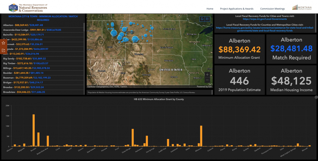
“It’s just a really hard thing to explain to folks, so having this mapping tool made it easier for people to understand,” Coleman said.
Residents and grant applicants could more easily make a connection between the gas tax formula and its impact on funding decisions—and also monitor what decisions were being made as plans began to appear on the map.
“I think that’s why spatial data works in this regard. We’re trying to communicate with the public,” continued Coleman. “We could share a giant 20-page table, but it just doesn’t play as well as being able to look and see what you and your neighbors are getting.”
Healthy Competition
The second ARPA grant program was purely competitive. Proposals were judged solely on merit. But Montana is home to both urban centers and rural areas; the sparsely populated east versus the more populous west; and longtime residents of modest means versus more affluent new arrivals. This all plays out against the state’s rapid population growth, enough for the 2020 Census results to earn Montana a new congressional seat. Yet, Montana was recently ranked as the nation’s seventh-worst state for infrastructure.
“We’re a very dispersed state,” Coleman said. “Legislators want to see ARPA funds spread evenly across Montana. They want to make sure that the smaller communities in their districts get a fair chance in all of this.”
DNRC’s map and dashboard of competitive grant applicants have served a dual purpose. As much as it promotes transparency by showing the public the geographic distribution of grants, it also allows Coleman and her team to test various funding scenarios, which supports internal accountability.
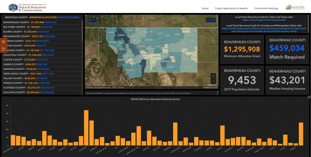
“We could show that funds weren’t just going to population centers,” said Corey Richidt, a GIS analyst and developer at DNRC. “We could even see the areas that are disproportionally affected by COVID.”
For Brian Collins, GIS manager at DNRC, the maps serve as a manifestation of the agency’s larger purpose—serving residents.
“Putting together this kind of information resource was a good reminder that we’re in a public service profession,” he said. “We’re providing customer service at a very high level to people that need it right now. And it’s very gratifying to put it out there this way.”
Christopher Thomas is the director of government markets at Esri and a founding team member of the Industry Marketing Department. Prior to joining Esri in 1997, he was the first GIS coordinator for the city of Ontario, California. Thomas frequently writes articles on the use of GIS by government. Follow him on Twitter @GIS_Advocate.
To learn more about how GIS helps governments align with federal funds to progress on health, economy, infrastructure and equity for communities, visit esri.com/en-us/federal-funding/overview.
Interested in becoming a Featured Contributor? Email topics you’re interested in covering for GovLoop to [email protected].


Leave a Reply
You must be logged in to post a comment.