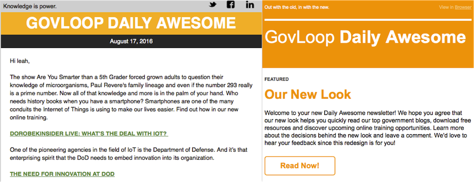
If you’re familiar with GovLoop, then you’re probably also familiar with our daily newsletter, the Daily Awesome. This newsletter has been a mainstay of GovLoop’s emails, and we put a lot of time and thought into packing it with the best gov content each day for our community (if by chance you don’t get the Daily Awesome, sign up here).
But lately, we felt we were falling a bit behind in the email design department. We try to create content that is timely, relevant, informative and well-crafted, and we wanted to build an email template to match.
So with that, we decided out with the old and in with the new (but with plenty of A/B testing and optimization involved)! Here’s what we focused on for this newsletter template redesign:
- Making it easier to read. The Daily Awesome includes a ton of great content but sometimes could be a bit text heavy. Large buttons and text may have made it hard to decide where to click. We opened up the design and included a bit more white space to make it easy on your eyes and conducive to reading on the go (or on your commute).
- Better organization. Ever notice the more clothes you buy, the harder it can be to keep your closet organized? Well, we noticed something similar as we upped the content in the email. We created more distinct sections for different types of content, resources and events. Think of it like storage boxes to easily find what you care about.
- Highlighting top content. We know that your time is precious and sometimes you can’t read a newsletter from start to finish. But we also don’t want you to miss out on anything. The redesign includes a “featured” section at the very top so you can stay on top of the latest, greatest content even when you’re short on time.
- It’s beautiful! We’re a bit biased but pretty thrilled with the end result. We worked collaboratively across the marketing, design and content teams to create a beautifully functional email that utilizes sophisticated design concepts. Looks aren’t everything, but we think the new design better reflects our brand and community.
What do you think? Any suggestions or comments on the redesigned Daily Awesome? Leave your feedback in the comments below!


Format good. My only complaint is that the “free resources” are not really free. Many that I downloaded in the past required an e-mail address and phone number, or obviously had them attached as part of my subscription. The result was the cost of the time and effort I had to spend trying to get a sales person to understand that I am not IT, but simply wanted to be informed of what was available or wanted to be more up-to-date. The interruptions to my time were significant enough that I have stopped downloading the material. I would like to see the ability to download the “free” material anonymously.
Thanks so much for sharing!
This version reads MUCH better than the old version! Even with a maximized screen before, the content would layer on top of one another. This is HUGE improvement over what it was previously! Well done! I can actually read everything now!
Aside from simply being able to read all of the information, the organization in this new format is fantastic, and very easy to sift through. The headers make it a snap to scroll through the message and find any pertinent information. The new format is fantabulous! Thanks for all the hard work!
Thanks for the great feedback! Our marketing and design teams did an amazing job and we’re happy with it too 🙂