

![]() Remember the good ole days of math class? Most folks tend to cringe when remembering their middle school math class. Crammed in that wooden, oh so squeaky, combination desk and chair mindlessly watching your teacher scribble on that green chalkboard in white chalk.
Remember the good ole days of math class? Most folks tend to cringe when remembering their middle school math class. Crammed in that wooden, oh so squeaky, combination desk and chair mindlessly watching your teacher scribble on that green chalkboard in white chalk.
Well, the bad news is that many of the concepts you learned (and probably have forgotten) from yesteryear are critical to the policy-related and business decisions you face today.
To help jog your memory, we will revisit three basic math concepts that every agency leader, policymaker, and business person should be aware of. These concepts play a pivotal role in driving true understanding and shaping how best to direct our government into the future.
Everyone is Better Than Average
Most of us are familiar with the term “average.” Averages are all around us – average miles per gallon, batting average, and so on. In an increasingly data-rich world, averages are (rightfully) used to drive policy choices as well. For example, average life expectancy, average student debt, and average per capita income play key roles in shaping the scope and scale of government initiatives.
However, the term “average” tends to be used loosely – especially in the media and in conversation. But precision matters. To really understand what average means when presented to us, we must dig into its definition. We must assess if “average” as defined is the mean or the median of the data under consideration. Two letters make a real difference.
To help us all out, a little context. The mean is simply the summation of a group of numbers divided by the count of numbers in the group. For example, the mean of 15, 8, 12, 87, and 4 is 25.2 (126 divided by 5). Conversely, the median is the “middle” of a group of numbers where half the numbers are higher, and half are less. Using the same sample of 15, 8, 12, 87, and 4, the median is 12 (sorted: 4, 8, 12, 15, 87). That’s a big difference!
For government leaders, really understanding what is meant by “average” when presented with statistical data is important. As evidenced by our simple example, there may be a major difference between the mean and median. The mean is influenced more by extremes and outliers, while the median is not. The more data we consider, the less skewed the mean becomes. Perhaps that is why “average” household income as tracked by the Census Bureau users the median while the “average” life expectancy as tracked by the Centers for Disease Control uses the mean.
Let’s dig in a little further to make this real. Extremely wealthy households (making $10 million or more each year) would likely drive the “average” income level of this country substantially higher if we used the mean instead of the median. If used at face value, an “average” income more than $100,000 per year would have profound implications for tax policies and social welfare programs. What defines “impoverished”? Who receives public assistance?
Similarly,” average” life expectancy in the US has been declining in recent years. With all of the advances of medicine and healthcare, that seems counter-intuitive. The explanation? The explosion of deaths caused by opioids and suicides. These causes of death are linked to younger Americans far more than older ones. The increase in deaths of those far below the mean impacts the average. Most likely, the median life expectancy would be largely unchanged over the same time period.
Thus, really understanding the definition of “average” — especially when it is bandied about in reports, the media, or during conversations – is a critical first step for informing policy decisions.
A Little Deviation Never Hurt Anyone
So far, so good? Next up: standard deviation. The idea of standard deviation is far less commonly used. That is because it is a bit harder to compute (square roots anyone?) and the number itself needs context. That is unfortunate. Standard deviation builds upon the concepts of mean and median. It adds tremendous explanatory power when attempting to decipher the implications of statistical data.
Simply put, standard deviation tells us how spread out or dispersed a set of data is around its mean. (Math note: standard deviation is calculated by taking the square root of the variance.) A larger standard deviation indicates that the data is more spread out, further from the mean. A smaller standard deviation suggests more of the data is clustered around the mean or there is less variance.
Let’s go through a simple example to make this real. Imagine two companies each employing five staff. All of the employees essentially do the same work and have similar professional experience. For all practical labor market purposes, they are the same. The hourly wages of the two companies are as follows:
| Company A | Company B | |
| Employee 1 | $15 | $8 |
| Employee 2 | $15 | $10 |
| Employee 3 | $18 | $18 |
| Employee 4 | $20 | $20 |
| Employee 5 | $22 | $34 |
| Mean | $18 | $18 |
| Median | $18 | $18 |
What would you say if someone asked you “which company pays more fairly?” I know fair is a loaded term but play along.
As you can see, both the mean and median hourly wage paid by Company A and Company B is the same at $18/hour. Case closed? Any reason for Employee 1 at Company B to be a little upset with his pay? Enter standard deviation.
Let’s look at the dispersion of wages for these two companies using standard deviation. The standard deviation of hourly pay at Company A is $2.76/hour. The standard deviation at Company B is $9.21/hour. Yikes! Clearly, Company A pays all its employees more similarly (read equally) than Company B. Some may even argue that Company B is paying its employees unfairly if indeed the skill sets and jobs of all five employees are the same.
That’s the power of understanding the implications of the standard deviation – especially in very large data sets with thousands or millions of data points. While understanding averages is a helpful and necessary starting point, digging into the dispersion or variance of the underlying data is vital. A larger standard deviation is no better or worse than a smaller standard deviation. It is all about understanding what the data say.
One principle that many policymakers and government officials seek to imbue in their approach to governing is fairness. Government policy, to the extent possible, should drive society towards greater equality and fairness.
For example, do we care more about average household income or income inequality between rich and poor? Do we care about the average educational attainment of our youth or the variance in educational outcomes between races and genders? Do we seek policies that reduce the average annual spend on health care or try to reduce the differences in treatment received between those who live in urban areas versus rural areas? All good questions that transcend math but are under-girded by it.
Standard deviation, along with understanding the actual distribution of statistical data (see below), are conceptual tools in informing that decision-making and policy-creation process. Ultimately, and more importantly, they help predict the resulting impact of those decisions as well.
Are You Bimodal?
Ready to graduate to 8th-grade math? There are numerous “distributions” when it comes to statistical data. A distribution, when visualized, is essentially a graph showing the frequency of a data point (Y-axis) occurring across a range of data points (X-axis). It surely gets more complicated, but let’s stick with that for now. Understanding the underlying distribution of a particular statistic makes a big difference. Let’s see why by exploring three common distribution types — normal, bimodal, and power law.
Normal Distributions
Most of us are familiar with the concept of the bell-shaped curve. After all, it applies to many aspects of our life. Human height and weight generally follow the bell-shape or normal distribution. The same can be said of human intelligence (IQ), SAT scores, and the return of publicly traded stocks. And we have all heard of and despise/aspire to be the kid who “breaks the curve.”
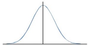
Normal distributions, as depicted below, have a symmetrical bell-shape. In normal distributions, the mean equals the median (see above). What is more, with normal distributions, 68% and 95% of all data fall within one and two standard deviations of the mean, respectively. This neat feature is what drives percentile calculations across domains.
Despite its frequent use, normal distributions represent simplicity in a world filled with complexity. A one “shape” fits all approach is flawed. Indeed, most policy-related domains have other distributions. This reality makes it important for government officials to understand the differences and implications of non-normal distributions when considering new rules and laws.
Bimodal Distributions
Another distribution type that many data sets follow is what is called bimodal. Bimodal distributions have more of a barbell shape with two relative peaks instead of just one (i.e., two modes). Examples of this type of distribution in real life include the number of patrons visiting a restaurant (typically peaks around noon and 7 pm for lunch and dinner, respectively), the speed limits on roads (clustered around 35 for city roads and 55 for highways), the frequency of doctor visits in a year (newborn children and toddlers as well as the elderly), and so on.
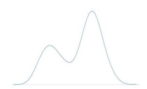
The key with bimodal distributions, as depicted above, is that the mean is useless. What really matters is the distance between each of the two modes and the relative frequency of each. Ipso facto, targeting policies to impact the average won’t accomplish anything. That is why understanding the underlying distribution of data is critical for policy makers.
Power Law Distributions
Power law distributions are fascinating. They are the manifestation of the 80-20 rule or Pareto principle. This type of distribution is surprisingly ubiquitous. For example, the popularity of movies, books, and music follows a power law distribution. In most cases, there are a small number of very popular items (blockbusters, best sellers, etc.) and then a long-tail of lesser-known items. (Side note: businesses have been formed to address the long-tail. See the birth of Amazon.)
The number of crimes a criminal has been charged with is another example of a power law distribution. The most notorious criminals have committed order of magnitude more crimes than the average citizen. The same distribution applies to the returns associated with venture-backed IT startups. Ditto with the leading causes of death in the US. Heart disease, cancer, and diabetes represent the overwhelming majority of deaths in our country.
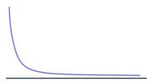
So let’s say you face a data set that looks like the graphic above. What is a policymaker to do with a power law distribution? There are a few possibilities.
- If the intent is to reduce the frequency of occurrence (e.g., reduce deaths), then there is a higher ROI from largely ignoring the long-tail and focusing on the critical few. For example, investing the preponderance of our research budget into heart disease prevention instead of preventing future terrorist attacks is rational.
- If the intent is to change the shape of the distribution (i.e., make it flatter), then there is a different set of actions that policymakers should consider. For example, if the goal is to reduce income inequality, simply giving everyone $1,000 a month won’t work. Sorry Mr. Yang. Structural changes are required at both the high and low end of the spectrum (e.g., changes to tax policy and incentives).
- If the intent is to have more outsized outcomes (e.g., more small businesses that become large businesses), crafting policies that make it easier to start and enter the data set matter. For example, lowering the barrier to new business formation and simplifying the small business tax code will encourage more entrepreneurship and eventually, if the distribution holds, create the next Google or Apple.
1 + 1 = 3
The sheer volume of data used to guide policy and legislative decisions is exploding. Understanding basic math unlocks the realities behind these data. Asking what “average” means can improve how we govern. Appreciating that all data sets are not created equal dispels myopic thinking.
Unfortunately, it is not entirely clear that our legislators are armed with the correct knowledge. I don’t believe they take a Statistics 101 when they decide to run for office. This lack of mathematical understanding leads to fallacious thinking, sub-optimal policies, poor-performing initiatives, and squandered taxpayer dollars.
Understanding the underlying “shape” of the data – the mean, median, standard deviation, and distribution – must be the first step for any policymaker, government leader, or executive. When it comes to crafting new laws that potentially impact millions, a little basic math goes a long way.
Wagish Bhartiya is a GovLoop Featured Contributor. He is a Senior Director at REI Systems where he leads the company’s Software-as-a-Service Business Unit. He created and is responsible for leading a team of more than 100 staff focused on applying software technologies to improve how government operates. Wagish leads a broad-based team that includes product development, R&D, project delivery, and customer success across State, local, Federal, and international government customers. Wagish is a regular contributor to a number of government-centric publications and has been on numerous government IT-related television programs including The Bridge which airs on WJLA-Channel 7. You can read his posts here.


Great blog, Wagish! I totally agree with you – a little math (and other basic skills like this) goes a long way when crafting and executing policy that affects millions.
Thanks Blake! Sometimes we overlook 101 principles because they seem too easy / basic. The answer must be more complex, right? The key is to keep skills/tools like these top of mind.
Math was my nemesis in college, but I love how you incorporate it into government!
Thanks Emily! Most folks share your sentiment. But you don’t need to get into differential calculus to appreciate how a little basic math can help government.