
This post is part of a series about the four envelopes that federal IT must “push” to restore public confidence in our capability to deliver superb citizen information technology services.
![]()
Having visited the Project Management envelope and the Enterprise Architect envelope, we turn now to the third of the four envelopes: User Experience (UE) – this week’s focus is building a new paradigm for federal IT.
Over my 40+ years of private and public sector information technology experience, it has never ceased to amaze me how much impact the I’ll-know-it-when-I-see-it principle has on leadership. No amount of specifications, requirements, and detailed planning has the impact of a well-thought-out information architecture (IA) – diagrams that literally show how pieces of an application fit together.
The best way to illustrate the User Experience envelope is to refer to an actual site that was built to support such an information architecture. The site was generated by a widely used UE design tool, Axure RP but could have been prepared as easily in Adobe XD or even in our architecture tool from the second envelope, Sparx Enterprise Architect 15. Our example site is patterned after an actual site development project built for an office of a federal public sector department.
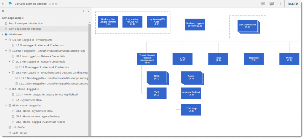
The GovLoop UX model site begins with a site map of the portal. The elements of the site map correlate with other diagrams on the left-side navigation tree. Following the wireframes, comps of the completed pages are shown. To complete the model, Style Guides are shown that provide metrics for implementing the design in both style sheets and in code.
Setting the background for our example, users are expected to log onto the site using either their username and password or an enterprise user authorization management system. Following a successful logon, they reach a portal that serves as a selector for either module that has been developed directly in the portal or external, legacy applications. Two examples of the modules are the Conference Tracking and Approvals module and the Security and Badging legacy application. A very simple user profile is supported since the enterprise directory system didn’t provide one that would allow even simple personalization.
As the site map evolves from initial concept through progressive elaboration, site designers began with the logon process. The primary form of logon was through the enterprise authorization management system (AMS) and that example was produced as a wireframe – a basic sketch of how the web page would be laid out. From a process perspective, the header and footer for each screen were created from “master” elements allowing for design-once-use-repeatedly processes that would allow updates without redoing each design that used either master element.
The other alternative for logon was using an email address and password. That example was also modeled as were examples of unsuccessful attempts where an error message would be displayed. The end result of the processes to this point is that the user was either logged on or not.
If the user was logged on, the main screen would be shown. The wireframe shown is actually a revision from the initial concepts. Since the user was logged on, any requests or actions that the user needed to take could also be displayed. Instead of requiring additional mouse clicks, it was decided as a matter of better user experience to display them along with the module selection carousel.
After modeling all the wireframes, including modifications and enhancements, a series of comps or comprehensives are shown that are graphical renderings of how those wireframe outlines would actually appear. This part of the design process gives managers and leadership recognizable examples that meet the I’ll-know-it-when-I-see-it criteria. It also gives usability experts first indications whether section 508 of the Americans with Disabilities Act standards are likely to be met for color and contrast, font sizing and spacing, and several other criteria.
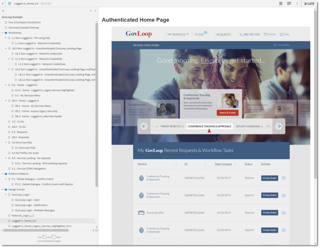
This landing page for the authenticated user shows not only the module selection carousel but any requests or workflow actions the user owns or is assigned to.
Finally, and once the design comps have been approved, a series of Style Guides can be produced that document the measurements, fonts, colors, and dialog particulars. These will be critical in producing the production style sheets and developer coding.
There is one additional step in this process that the example model shown here does not include. That’s the animation function. It’s possible to make these mock-ups of the pages actually perform as if they were live pages with buttons and controls that work just like their fully-developed counterparts. Axure provided an example of a model page that has these animation features fully implemented. Just imagine if the healthcare.gov site had been modeled like this and subjected to feedback from the public before its ill-fated launch.
From Process to Envelope
Having walked through the example we’ve used here, it should be obvious how much sharing this model could be useful to the public – we get an early view of what the project expects to deliver and what it will look like when it does. Coupled with the project management and enterprise architecture envelopes, this user experience envelope gets us closer and closer to seeing and understanding what our tax dollar investments are doing, how they’re going to work, and what they’re going to look like. The amount of design feedback from both the public and academic comments could provide value that is currently unavailable to the project team to their detriment. Putting these three envelopes together and presenting them to the public as the project is actually progressing could provide a source of invaluable commentary, improving both the transparency and progress of such investments.
Moving on…
Next up, we’ll move on to the fourth envelope: Collaborative Development – the cornerstone of best development practices in the federal public sector and the payoff envelope in the series. Following that, we’ll look at how these envelopes could be combined into a coherent, consistent presentation format enabling the public-project team collaboration that will result in pushing all the envelopes.
A retired naval officer, Richard Warren entered public service in 2009. He holds the PMI Project Management Professional, Risk Management Professional, and Agile Certified Practitioner certifications and currently serves on their Federal Sector Executive Roundtable and other PMI executive roles. He also holds the Federal Acquisition Certification in Program and Project Management at the expert level. He was a founding member of the U.S. Digital Service at the request of the Federal Chief Enterprise Architect and the Obama administration.


Leave a Reply
You must be logged in to post a comment.