
When they take attendance in the digital career domain, can you say “present?”
I can’t—yet. But, as we decide how to package our skills, knowledge and experience for a digital world, we can help each other get there.
The traditional resume was on life support in the previous installment of this post. The inevitable will be here sooner than you think. Which means we have to get ready now to start building a digital web presence to organize our career self-portraits.
In this post, we’ll explore the strategic use of web presence to coordinate your online resume, profiles and content on social media, and samples of your work. Your hub revolves around a USP—your Unique Selling Proposition.
There’s nothing magical about the term USP. It’s known in the branding business as Unique Selling Proposition or Unique Selling Personality, but whatever it’s called, USP is what makes you different from others in your field.
It’s what makes you perfectly matched to the job you seek or the needs of your customers. It’s the answer to the question, “Why me?”
It’s the advantage you’re selling.
As you create your web presence, and reflect on the unique personality that you want your visitors to discover, one of the first strategic decisions you make is to set the “right” tone. Only you can determine what the right tone is.

Strike the right tone with your web presence. What ambience do you want visitors to experience when they enter your site?
The tone of your pitch.
How do you select your tone?
You start by imagining what it will be like for a user to interact with your website. These days, they’re calling that interaction “User Experience,” with its own acronym—UX. What tone do you want your user to experience when they are interacting with your website?
The infrastructure of your website includes your domain name, e-mail address, overall web page design, and the quality of writing and graphics. Each presents an opportunity to establish and reinforce your tone.
Tone is a powerful word in many disciplines. We talk about muscle tone to describe firmness and strength. In art, tone may refer to color brightness, deepness, intensity or hue. Music is rich with ways to express tone, with fluctuations of intonation, modulation and pitch.
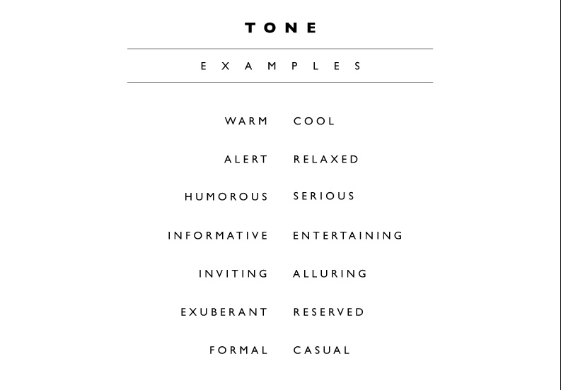
The truth is that there’s no limit to the number of ways—or words—you might use to describe the tone you want to set. In the previous post in this series, I said that there are two distinct tones that I use when communicating. I used words like “serious, formal, and reserved,” then contrasted them with “whimsical, fanciful, and extroverted.”
Brainstorming can help generate new ideas to describe your tone. You can conduct a session in the office or at home. Brainstorming works better in a group—invite some friends over. Or share a conference room with some co-workers. But regardless of whom you’ve gathered, tell them you want to make a list of tones for your website. Have some fun with this. There are no right or wrong answers, and judgment should be left at the door—no idea is too wacky. You’re probably going to be the scribe, to record the words captured in the interplay. This part is easier to do at work, unless you have a flipchart, easel and markers at home. Treat it like a game. And see what happens.
Here’s a list of sample tones to get the ball rolling. You may not want to reveal these to the group all at once. It’s better if they emerge naturally in the course of play.
Later, after you’ve contemplated the ideas gathered, leave them alone for a bit. There is actual science behind the phrase, “Sleep on it.” So do.
Once you have determined the tone you want to set, deciding about your domain name, e-mail identity, images, and text should be easier.
Professional and businesslike.
Two words that are likely to have an impact on any tone you may select, “professional” and “businesslike,” are nearly worn out from frequent use. To create an online personality that presents you in a serious and professional fashion, you need to look and sound businesslike, forward-thinking and creative. I believe that “professional” and “businesslike” are different characteristics and that we should strive to embody them both.
“Professional” connotes mastery of your craft—your expertise, integrity, etiquette, adherence to established standards of conduct, and respect for those with whom you interact.
“Businesslike,” on the other hand, speaks to knowledge and understanding of commerce, the ethical pursuit of profit, and the ability to achieve and succeed in a competitive and results-driven marketplace.
Government overall has cultivated high professional standards. From the individual worker to an entire agency, we take pride in the jobs we do. But we have virtually ignored the way commercial business operates as a yardstick for our own performance. This is changing. Government is becoming increasingly results-driven and more businesslike. As public servants we are growing our awareness of what qualities are rewarded in the rest of the world.
# # #
Learn from my dentist.
When we talked about websites, Joel, my friend and dentist, said that he thought his web design and hosting provider was hearing but not listening when he explained what he wanted. Like so many professionals, Joel wanted a very quiet website that didn’t smack of marketing. His daughter, educated as a marketing expert, warned, “Don’t look too slick.” But what he really wanted to be able to do on his website was to update his own Dental Procedure Patient Fact Sheets and make them available for patients to download and print. Joel wanted to create, edit and add new fact sheets to his website—by himself, at his convenience, quickly and for free. You’ve seen fact sheets like Joel’s in just about every medical or dental office. When a patient is advised to have a particular procedure—an extraction, for example—Joel wants them to consult the website, read FAQs and other useful information, and print if desired. He believed that this would make his patients better informed and less anxious.
Joel asked how my website was coming along. I probably groused about the expense of getting my domain registered, my site designed, hosted and managed, and the time it would take to add huge image files for my work samples and keep the text current.
Why go through all that misery? Joel advised, “Don’t pre-invent the wheel. Just use a template—you can probably get one from your hosting service, for little or no extra charge. After all,” Joel reminded me, “it’s not as if you designed websites.”
Since my business is brand identity, it is important for my website to reflect the quality of the services I offer. My web presence must be a good advertisement for my judgment and taste; I need one that’s pretty darned fantastic. (This isn’t arrogance; it’s what customers expect for their dollar.) With a mediocre web presence, I’d be worse off than I would be with no website at all.
Joel’s next patient was due shortly. I didn’t get to explain that a brand identity should be expressed in all media— logo, reception area and other facilities, sign system, video, PowerPoint, advertising, and marketing material in print, broadcast or online. And on the client’s website.
So you see, I do design websites, that is, I direct the design of websites as one component in an overall brand identity.
As he bid me farewell, Joel unintentionally delivered the coup de grâce, saying, “Take a look at mine. See the template I used. I got it from my hosting service.” Not only had I already taken a look at his website, I was so moved by the awfulness of it that I did a re-write of his introductory paragraphs. I buttoned my lip about his use of white type on a medium-blue background. Not a word did I whisper to protest the use of bold, italic and bold italic type, sometimes all in the same paragraph. I held my breath rather than point out that there was so little white space on the page that readers were threatened by visual asphyxia.
(Actually, there’s no white space at all. Because Joel’s pages are all blue, blue is the color of whatever vacant space there is.)
There is no point for me to describe the text. Editing it broke my blue pencil.
None of my judgments has anything to do with looking “too slick.” All I really want to do is professionalize Joel’s site to keep it from looking home-made.
But Joel would strongly resist any suggestion about the benefits of some copy work or re-design. He has convinced himself that any upgrade would give the place a tone that was too commercial, too slick. I don’t think that the stealth approach would work, either. That’s when you tell the client that you just want to do some “tweaking,” or “fine tuning,” when you really mean, “I’m going to demolish your pitiful effort and start from scratch.”
I did the rewrite of Joel’s home page for my own sanity and felt much better. I’m not sure if I’ll even show it to him—probably not. Neither clients nor friends are receptive to solutions for problems that, in their view, don’t exist. No matter how well you understand the weaknesses of their materials, unless they perceive them the way you do, you’ll squander time and court frustration if you continue to push.
Picture this.
Just as Joel would not appreciate, and in fact might be offended by, input from a branding guy like me, he very likely does not appreciate the value that a professional photograph would bring to the overall quality of his website. Joel’s current photograph is a snapshot taken in his office. You can see visual noise behind him: a window with reflective glare, out of focus bookshelves flattened under fluorescent light.
But to his credit, and despite his website’s flaws, Joel has used campaign thinking to create continuity between his web presence and other communication vehicles, like print and printable collateral material—downloads and hard copy brochures.
Joel just needs some help with the visual aspects of his web presence, and by extension, his collateral material. And I need to find a kind, diplomatic, logical and effective way to raise his consciousness about design. He doesn’t have to know much about good design to appreciate its importance.
Joel already has plans to increase the effectiveness of his web presence. After getting the patient fact sheets up and running, he wants to automate the check-up appointment reminders, making them a value-added “spoke” attached to the hub of his web presence. Joel envisions e-mail reminders with built-in graphics to tell patients that their routine hygiene appointments are coming up.
Can his current hosting provider do the job for him? He has his doubts—you’ll recall that Joel felt that his web hosting provider was not tuned in to his concerns as a customer. I’ll keep you posted.

Joel wants to automate dental appointment reminders with an e-mail-based system that’s part of his web presence.
# # #
On the road to simplicity.
Roger Horberry is a language maven. The very first text that readers encounter on his web page is his self-definition:
I AM AN INDEPENDENT COPYWRITER, AUTHOR AND TRAINER.
Roger displays clarity of thought. He provides an eight-word summary of his core competencies. I consider Roger to be a role model, benchmark and, perhaps soon, competitor.
Go to his website: www.rogerhorberry.com. Note that Roger’s curriculum vitae is available from his home page; you’ll find it has a tab on the upper menu bar. When you take a look, his C.V. is quite sober, conservative, black-and-white, nothing too unusual or fancy. And blessedly brief. He has had a long career, but his resume is on one page, with ample white space, which shows the discipline of a good editor and a becoming modesty.
Treat yourself and buy his book, Sounds Good on Paper. It is an elegant little book and a joy for anyone who loves words and word play.
The other night, over lobster bisque, I saw the resume of an ex-fed who now works in employee communications for a large technology consulting company. Five pages, maybe six? I looked at it online, so it’s hard to tell how many printed pages it equates to. I’m curious about what my readers think. Is there an outside, do-not-exceed page limit for a resume?
Roger’s site just got an injection of vim and vigor—he has installed a photo-and-caption blog, very light on the captions, commenting on language, communication and advertising, reflecting on world events, and making social commentary.
Should I follow Roger’s example? The rest of his site displays some of his creativity, and lately, more of it, but all in all I think that Roger is gearing himself to a corporate audience that prefers things conventional and quiet.
I’d really like to emulate some of how he has organized his website and packaged his content. Roger defines his product as Words for Brands. I wish I’d thought of that!
# # #
Reign over your domain.
Your domain name is, of course, the identifier that is part of your URL and your e-mail address—just like amazon.com, irs.gov, stanford.edu, navy.mil, and comcast.net. If you want to look serious, professional, and businesslike, leave the domains of free accounts (gmail.com, yahoo.com, hotmail.com and the like) to family websites, where your professional identity isn’t the focal point. Spend a few bucks and make your e-mail address your own.
Your e-mail address—[email protected]—can be provided by your domain registry, web hosting service, or both. You can protect your domain name by paying a fee for one year or two.
Community organizations, non-profits, houses of worship, independent charitable organizations and many others use the “.org” file extension. But if the dot-com version is available, I think there’s value in registering that one too. Even entities without commercial objectives can strengthen their web presence with a dot-com domain.
There is an excellent guide to choosing the right domain name at: http://v2.registar.com/tutorials/5-rules-to-registering-a-domain-name/
Seven million dollars.
Because so many great names are already in use, and even greater ones are for sale, you’ll need to be flexible and use trial and error to find a domain name that you like, is available, and within your reach. (beer.com may be out of your reach. It sold in 2004 for seven million dollars.)
The domain name industry has created a new market for more extension flavors: .tv, .cc, .info, and others. In the lunatic fringe category, you can now reserve a generic domain extension (gTLD) to use when thousands of them are made available—in the “very near future.” My advice: Make haste slowly.
Website design.
For my web presence project and many others, I have been looking for a talented young web designer who’s still building his or her portfolio and considers working for me to be a good investment of their time, even if I can’t pay them very much. I am prepared to resort to a website design template if I can’t find the right person and an arrangement that would suit my needs.
I’m told by those who are knowledgeable in these matters that the cost of designing a website from the ground up is rarely justified. I thought I had to have one built from scratch to demonstrate that my ability to direct web design was as good as any others in my field.
Working well with designers is important to my identity and adds value to what I sell. And the truth is that I’m very picky about visuals and know my own limitations. This isn’t the sort of work that I’d ever attempt myself or turn over to just any designer. I want a professional whose training, taste and talent are among the attributes of what I consider a “real” designer.
My perspective on custom-designed websites has done a one-eighty in the last couple of weeks. Over another bowl of lobster bisque, this time with a savvy ex-fed design director, I learned that even she, with all of her contacts in the world of design, couldn’t find a seasoned web designer who wanted the work and was willing to put up with the hassle. The ones she knew and trusted were wary of the endless hours of user support they would surely be asked for, as the neophyte client would plead for a hand-held walk-through of every single change. They didn’t want to be held hostage by needy clients who couldn’t write a bit of HTML and had no clue as to why they needed to.
That isn’t to say that you can’t find a hungry designer who needs the work and will do nearly anything. But if you haven’t engaged providers of web design services before, be aware that a hungry designer and inexperienced client make for a volatile and often explosive mix.
It takes finesse to find a steady balance between experience and cost.
Maurice is an expert designer and engineer with whom I’ve collaborated on a number of projects. He’s easy to work with—energetic and upbeat, with an off the wall sense of humor. But he doesn’t want to do my website design. (He was diplomatic but firm.) Maurice tells me that it’s no longer the case that websites built with WordPress, an off-the-shelf content management system, make their origins instantly recognizable. Only recently, it was easy to spot a WordPress template by its telltale typeface, rigidly-structured zones for navigation and tabs, and cookie-cutter page layouts. (I don’t mean to single out WordPress. The same is true for other content management systems—Drupal is one.)
Another caution. While it’s true that more and more users are building their own websites with templates, the templates themselves and the infrastructure that supports them vary widely in quality, flexibility, and ease of use. Sometimes templates come only through a hosting service with a lot of strings attached. One hosting service won’t even let me look at their templates until I commit to buying a “site-building” package on a monthly contract.
Entrepreneurs: Seize on this idea.
If only somebody would invent it! I would be thrilled by and loyal to a new kind of business. For the moment, let’s call it SiteLaunch. (Whoever actually creates this thing will certainly come up with a better name. They might even call in a brand strategist to help.) SiteLauch would be run by a web-savvy staff, a mix of part time and full time students and retirees—anybody who really knew their stuff. The offering is a website design consulting service, with strictly defined boundaries. Staff members (called Launchers, perhaps?) would ask good questions to determine customer needs, learn about the customer’s customer and the unique selling proposition offered to them. The SiteLaunch staff would also assess the customer’s familiarity with design principles and their aesthetic likes and dislikes. The emphasis is intended to be on web design guidance that enables the customer. The principal objective is to help the customer get be ready to launch his own site.
If I were their customer, Launchers would select a template for me, load image files and text that I provided, and adjust the final product to my liking. They would wrap things up with a job aid with step-by-step instructions for how to make changes and add new content on my own. SiteLaunch would then turn over the keys, shake hands and say “so long,” their responsibilities discharged.
It’s easy to say that, if a customer had a technical problem, they should connect with 24/7 support from their hosting provider. But that really is like shoving the customer into a shark-infested pool and tossing in a directory of harpoon designers. Of limited use in the short term. And even less useful once the customer has been julienned. One of the challenges of this business will be finding a way to limit support expectations, while pointing customers to a capable resource to help with limited service.
Can I find my SiteLauncher? Tell me what you think.
Photograph.
This is no less than the portrait of your digital identity. Didn’t I rant and rave a great deal on the fundamental necessity for a professional photograph in the last installment of this post? Oh, yes. And I’ll go on ranting in the next installment. Creating your photograph is simply the most critical design action you can take. More essential than the font you use or the color palette or the fine illustrations, more essential than anything—is a head shot taken in a studio with the proper lighting, background and positioning by a professional photographer.
Your photograph is more important than the text on your website.
Trust me, when a writer tells you that your photograph is more important than the writing, take his opinion seriously. Although I’d love to think that my words were so magnificent that they trumped any mere picture, but just the opposite is true. Your audience won’t read a word if they’ve judged you not worth their time based on a less-than-professional photograph. This judgment takes place subconsciously and in a millisecond.
Don’t turn your visitors off before you get a chance to tell them how much you have to offer.
# # #
J.T. Kerwin has been writing about information technology since the dawn of the personal computer—starting with ad copy for the first Chicago dealer of the IBM-PC. Later, as a communication strategist with Xerox, he was among the earliest users of the original mouse, icons, Ethernet and e-mail. He has created brand identities for IT spinoff companies, startups and programs within the federal government. J.T. is now a brand strategist for a federal agency that sells security products in a competitive environment. His blog posts reflect his background in creative communication, language and design. J.T. believes that everyone can discover their inherent creativity and develop their own brand personality—contributing more to their federal mission and accelerating their own success.


Leave a Reply
You must be logged in to post a comment.