
![]()
Many federal agencies deal with complex regulatory and scientific topics. Bioscience, cryptology, network security, the physics of weather or weapons. But often the stakeholders and decision makers are not technical. Here are seven practical steps for communicating science to non-scientists.
- Provide context for numbers – What does 9 means? If it’s a 9 score out of 100, that’s not good. If it’s a payment of $9 when everyone else got $4.50, that’s twice as good. Never assume the reader knows what a number means. Always provide context.
- Use concrete numbers for a greater emotional impact – In a study by Yamagishi, people rated a disease that kills 1,286 people out of every 10,000 as more dangerous than a disease that kills 24.14% of the population – despite the fact that the 2nd statistic is twice as deadly. Follow-on research by Paul Slovic found that risks in the 10% and 20% range were viewed as safe but the same level of risk presented in concrete numbers created frightening images. It’s easier (and scarier) to visualize 1,286 diseased-ridden dead bodies. So if you want to elicit concern/action around a statistic, use a concrete number. See excellent summary article by Ellen Peters that references both studies.
- Add the “so what” – Often the way information is phrased by a scientist or engineer cannot be simplified without changing or confusing its meaning. Or it may be important to include formulas, codes, or scientific symbols because the communication is meant for both technical and non-technical audiences. If that’s the case, use the exact information provided and then add the “so what” – “so what this means is a 30% reduction in cost” or “so what this means is that x lives will be saved over the next 10 years.” Pull the “so what” out of your subject matter expert – keep digging until s/he provides it. You’ll be glad you did because it’s often the key to story.
- Remember the “rule of 3” – Humans process information by seeking patterns and three is the smallest number of elements required to create a pattern. This combination of pattern and brevity results in memorable content. You see three items everywhere –
“Life, liberty, and the pursuit of happiness”
“Blood, sweat and tears”
“Larry, Curly and Mo”
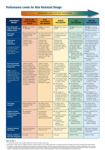
Red=risky and blue=safe. The green/blue columns list technical standards needed for Louisiana healthcare facilities to shelter-in-place. Facility owners used this document to collaborate with their architect/engineer/contractors.
So narrow down your topic to three key points. Or pick one key point and support it with three arguments or examples.
- Equip decision-makers to “talk technical” – Visual cues such as icons are a good way to communicate across languages, cultures and education levels. Colors have universal meaning as well: Blue is a cool color associated with safety. Red is a hot color associated with danger.
While it is important to help non-technical decision makers to understand science and engineering, it is equally or maybe even more important to equip decision makers to provide clear instructions to their technical team and to make informed decisions.
Following Hurricane Katrina, the Louisiana Department of Health and Hospitals wanted to encourage private-sector healthcare facility owners to retrofit their buildings so it would function through a future hurricane and patients could shelter-in-place. This sheet pulled information from a 200+ page technical document full of specific International Building Code citations that only an architect, engineer or experienced contractor (A/E/C) would understand. The document included color coding for easy identification – “red” means no building codes were used when this building was initially built – “yellow” means the building meets current buildings codes — “green” and “blue” means the building is built above code and should be able to operate through hurricane winds and flooding.
This sheet equipped the facility owner to “talk technical” with their A/E/C – “tell me where my building is on this sheet and what it will cost me to get it to green or blue.”

Retired NOAA Engineer Mark Walton built this model as a hands-on way to explain the math and science of flooding.
6. Make it interactive: Studies show that hands-on training is more effective than traditional lecture style. Retired NOAA National Weather Service engineer Mark Walton arrived at a high school class with PowerPoint to explain floodplain management and got an earful from their science teacher. Together, they built a large plexiglass floodplain model which allows kids to pour water at the high end and watch how upstream development results in flooding downstream.
Today the model is available for purchase from a school equipment manufacturer and Mark spends his retirement promoting its use across the U.S. as a public service. The flood model has been used in court along with expert testimony … in front of city councils considering water resource projects … and pro bono by local floodplain managers at schools where students and their families have lost everything to flooding.

Tom Cook’s wife was killed and his home was destroyed in a tornado. He rebuilt with a FEMA safe room and it saved his and his daughters’ life. Look for a human story to promote your technical information (video courtesy of FEMA).
This is one example of the power of hands-on learning vs. lecture format. Almost anything can be made hands-on. It’s not easy but it’s worth the effort.
7. Tell a human story – No matter how technical a topic is, there are humans involved somehow. Studies show that individuals give more to charities that reference a single person (a starving child) vs. statistics (100,000 children will die of hunger). People are inherently interesting. The story of a man whose wife died in a tornado makes a better case for adding a tornado safe room to your house than a room full of technical guidance with wind load calculations and schematics. Find that human story and tell it.
Janice John Roper-Graham is part of the GovLoop Featured Blogger program, where we feature blog posts by government voices from all across the country (and world!). To see more Featured Blogger posts, click here.


Leave a Reply
You must be logged in to post a comment.