

Let’s just get this out of the way first: If you haven’t yet taken the 2020 Census, stop right now and go to 2020census.gov to provide your information. It takes about six minutes and is invaluable to your community.
We can wait… ![]()
OK. Now that you’ve done the bare minimum, let’s talk about other government questionnaires.
Just like the U.S. Census Bureau needs your information to determine representation and fundingpriorities, as a local government practitioner you need to collect information from your public. Is your community interested in your program or project? Do they have ideas that you should include in your decision-making process? Are there concerns or issues that you should address before going ahead with your project? You might just need a survey to collect the community’s input.
There are already lots of “best practices” articles about designing surveys for local government, and I don’t think we need to re-invent the wheel. I’d recommend these articles right here on GovLoop:
What I want to talk about is what you do once the survey is closed. I find that government staff are great at seeking participation from the community. We’re even pretty good at incorporating that feedback into the final programs and projects that we stand up in our communities.
What we often do poorly — and to our own detriment — is the follow-through. We fail to draw a line for the community between their participation in the project and the final results. We conduct the public process, we plan for diversity and inclusion in our public participation efforts, and then we forget to tell the community how their efforts influenced the final plan.
It’s like running a 400-meter race in first place and then stopping just short of the finish line.

Athletes at the finish line
(sorry, but I work for “Olympic City USA” and I’m required to make an athletic reference at least once)
In my experience, the community’s desire to participate is only temporarily satisfied by the opportunity to take a survey or give their input. What they really want to know is how their input was incorporated into the project.
It’s the same reason you look for yourself first in a group photo — we have a basic need for validation. Once that need is satisfied, we move on to more productive work, like problem-solving.
How can we emphasize the relationship between the feedback we receive and the final project decisions?
As we ask for feedback on aspects of our project, we know that the project will be influenced by the feedback we receive. Along with professional standards and direction from elected leadership, community feedback helps us do our work for our stakeholders.
I’ve seen reports of public participation efforts delivered as:
- Printed stacks of paper listing every comment received
- Word clouds
- Coded responses (topic + positive/negative value)
- Summarized comments
Each of these has potential benefits and drawbacks. We want to provide the ability for participants to identify their comments (so that they know they have been heard), but we also need to summarize community feedback into a format that can be used for decision-making. And then we need to visualize the flow of public comments to the final decisions.
Visualizing public comments
You may have come across budget visualizations using a Sankey Diagram. These diagrams have become popular for showing revenue streams flowing into the city and expenditures flowing out to projects and departments.
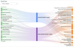
Oakland OpenBudget
The same type of diagram can be used to connect community input to decision-making. I’m working on a transportation project right now, so I mocked up a diagram to show how the various public comments influenced the project team’s design decisions:
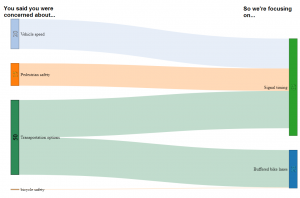
Sankey diagram showing the relationship of public comments to decisions
Our goal with this diagram is to explain how the community’s input has helped drive the decision-making process for this project. Along with a register of the specific comments (again giving the participants the opportunity to see themselves in the big picture), this type of diagram can help us summarize comments into categories while showing how they map to our decisions.
There are quite a few online Sankey Diagram generators to help you create visualizations. I’d love to hear about tools you use to create visual representations of your public processes.
We do so much work to make our public engagement events inviting, inclusive and productive. We can find better ways to show our community that we have heard their input.
Let’s get across the finish line!

Do you have useful ways to visualize community feedback and relate it to decision-making? I’d love to hear about them in the comments below. Let’s connect!
Jay Anderson is responsible for digital engagement and public processes at the city of Colorado Springs. Jay holds an MPA from the School of Public Affairs at the University of Colorado – Colorado Springs, where he also serves as the Chair of the Dean’s Community Advisory Board. Jay focuses on the point of engagement between the community and its institutions, creating programs that give a voice to people who want to have an impact on their government.


Leave a Reply
You must be logged in to post a comment.