
If you’ve ever worked on a website project, you know one of the first questions a designer asks is: What are your favorite websites?
But, it’s not always easy to come up with a list of the best websites. Great websites have to be memorable, modern, unique, and free of frustrating glitches—no small feat for most government websites.
If you’re looking for website inspiration, turn your eye to award-winners. The Center for Digital Government recently announced its 2015 Best of the Web award-winning government websites. The awards “recognize city, county and state governments for outstanding portals and websites based on innovation, functionality, productivity and performance.” State, county, and city websites were judged in their own categories.
Here are five website best practices gleaned from a few of the best government website winners.
1. Plain language, front and center
When you work on an issue day in and day out, it’s easy to grow blind to the jargon, complex terminology, and confusing acronyms and phrases you use. Plain language on government websites can help people better learn about the services your agency offers and how they can get the support they need.
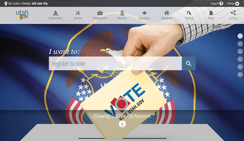
The Utah.gov website presents information in simple, plain language that’s easy to understand. It pares content down to as few words as possible that still clearly conveys what people need to know. This plain language shines on the homepage search box, which uses a straightforward “I want to” prompt that people complete with a description of what they came to the site to do.
2. Designed for users
People come to websites to accomplish a task, find information, or get something done. The success of your website depends on how well you understand what your most important audiences are trying to do. By creating user stories and even customer journey mapping, your agency’s website can provide an optimized experience for visitors.
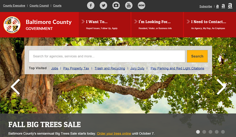
The Baltimore County, Maryland website homepage is a spare portal, offering just enough information to move people along to the next click. If people aren’t sure where to start, the top menu provides three options to choose from that can’t be missed for their bright red color.
3. Made for scrolling
Next time you’re with a young adult, watch how they use their phone or tablet. They scroll down screens faster than you flee the office on a Friday afternoon. Scrolling website design is all the rage because it addresses how real people often interact with websites.
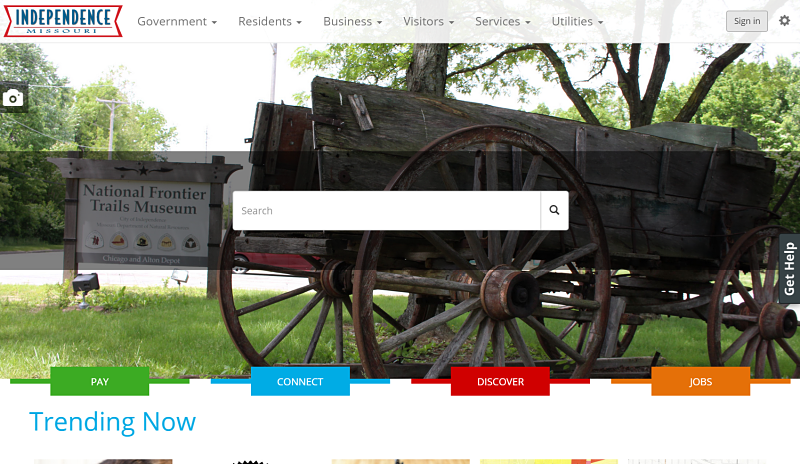
The Indpendence, Missouri city website is designed to be scrolled through. Information waterfalls down the homepage. Colorful images entice users to pause and bold buttons grab the eye. Big headers, ample white space, and a few subtle animations also call attention to key content.
4. Mobile ready
Woe is the government agency that still ignores mobile users. As Americans increasingly rely on their smartphones and tablets to go online, most digital technology managers have accepted they need to plan and design for the mobile masses.
First place award-winning state website, Arkansas.gov, provides as smooth a user experience for mobile users as it does for those using a computer. There’s even a mobile app for anyone who wants to have even more state government information at their fingertips.

5. An option for the data-less
As more government information moves online, it’s important to remember that the digital divide in the U.S. is still all too real and perhaps widening. Not everyone who needs information from a government website has a modern enough device or adequate data plan to handle the burden of an image-heavy website.
The Sacramento County, California website handles this in a clever way. It provides an unobtrusive button to change the site to text only. Without multimedia graphics, the county website loads much more quickly for users who don’t have much bandwidth.

Have you come across a government website that made you take notice? Share it in the comments.
Lauren Girardin is a marketing and communications consultant, writer, and trainer. Find her on Twitter at @girardinl.


Leave a Reply
You must be logged in to post a comment.